eCommerce’s growth rate worldwide is expected at 9.4% in 2024, and this growth rate is set to hold steady in 2026 at 8.6%, which will bring total e-commerce sales to $7.5 trillion. The revenue is also expected to show an annual growth rate at a CAGR of 11.17% during 2023-2027. The growing market size and revenue have lured many businesses to start their eCommerce platforms. Despite increasing consumer preference for e-commerce, most eCommerce platforms are still struggling to increase their sales and find it hard to acquire a loyal customer base. According to experienced entrepreneurs, Poor planning and design are two of the most important causes of e-commerce failure.
Entrepreneurs can always hire top eCommerce developers to make sure that they do not face failure while building an eCommerce platform. However, knowing the pitfalls is always a good idea as it allows businesses to prevent the issues before they deepen the woes. In this blog, we will look at some of the most common mistakes that ecommerce platforms make.
Table of Contents
- 11 common factors that made e-commerce platforms fail
- Not designed for mobile responsive
- Avoid baffled homepage
- No personalization
- A large Number of Crashes
- Low-quality product images
- A large response time
- Lack of clarity in the order Checkout procedure
- Lack of financial security that shakes users’ trust
- Essential functions out of thumb’s reach
- Ineffective search feature
- Improper design of Ecommerce Platforms
- Wrapping up
11 common factors that made e-commerce platforms fail
Most e-commerce platforms do not necessarily fail, but there are several reasons why some may not achieve the level of success they initially hoped for.
Here are the top reasons for the challenges faced by eCommerce and mCommerce platforms to succeed, along with examples:
Not designed for mobile responsive
A big reason why ecommerce platforms fail is UI & UX design not optimized for mobile, which means the ecommerce is not mobile responsive. As mobile traffic has increased phenomenally in the past few years, it forms a significant chunk of today’s total internet traffic. Experts find that most websites are designed such that the mobile version acts as the web version on a small screen. Such an approach limits the ability of the platform to provide an engaging mobile experience to the users.
Examples of poorly designed UI/UX are e-commerce platforms like Kayak and Skyscanner. Upon viewing these platforms, one can clearly see that they are not built for small screens. The inability of these platforms to perform on small screens pushes the users to other websites.
Another example is Walmart Canada, which could have easily been on the list of flopped e-commerce apps, but the development team at Walmart realized where they were wrong and made the changes accordingly. Walmart Canada wanted to improve its conversion rate. The team at Walmart found out that a majority of their customers were using tablets. Walmart Canada decided to have a re-look at their website to make it tablet-first. What they noticed was that they needed to make their website more “touch-centric.” A “touch-centric” website is both touchable as well as “clickable.”
The eCommerce web development team needed to identify ways to present everything in a friendly manner on a smaller screen. The tablet-first approach of Walmart Canada helped the team lay the groundwork for adapting the website on an even smaller screen, the smartphone. The team learned where they should condense the information, which helped them build a site that looked good on the smartphone.
Avoid baffled homepage
The homepage of an e-commerce platform, be it a website or mobile app, is the first thing that users notice. A primary reason why online e-commerce applications fail is that they try to put too much information on their home pages. Trying to put too much information on the homepage is an example of bad UI/UX design, as the users have to struggle against a lot of irrelevant information before they find what they are looking for. Although the first impression is not the last, it is a lasting impression, and a baffling homepage will give a pretty bad impression. The homepage design should be aligned with the target audience’s requirements, and it is vital to have a coherent and straightforward flow. An over-complicated homepage will confuse the visitors and prompt them to leave. A clutter-free and straightforward homepage of the e-commerce platform streamlines the process and facilitates easy decision-making.
The website of the luxury fashion retailer “Gucci” is expected to convey elegance and sophistication. If its homepage were cluttered with unrelated products, flashy animations, and inconsistent design elements, it would fail to uphold the brand’s image and discourage potential customers. Creating a user-centric homepage design while prioritizing a clean, organized layout, intuitive navigation, and personalization enables Gucci to create a positive user experience that encourages engagement and conversions.
No personalization
One of the most substantial incentives for users to download an e-commerce app or use ecommerce website is personalization. According to a report, many eCommerce platforms miss out on significant revenue opportunities by failing to personalize the customer’s shopping experience.
Following are how eCommerce platforms can personalize the user experience.
- Remember the user’s previous searches.
- Save the purchase record of the user.
- Suggest similar products that suit the user’s shopping history
- Offer easy navigation and checkout.
Personalization ensures that the customers keep coming back for purchase, and it also reduces the cognitive load of the customers by easing the decision-making process.
Sears faced significant challenges in the digital age. At the same time, personalization was one of the issues among many that contributed to its decline. Ineffective usage of customers’ data makes the store fail to deliver personalized recommendations, customized content, or product suggestions according to individual preferences. On another hand, successful eCommerce platforms like Amazon and Netflix have thrived by embracing personalization to enhance the user experience and drive sales.
A large Number of Crashes
Amazon.com lost $66,240 per minute in 2013 when the e-commerce site crashed; imagine the amount today. For an e-commerce site, it is critical to avoid frequent crashes for smooth operations.
Here are a few reasons why e-commerce sites crash;
- Coding errors
- DDOS attacks
- Unusual traffic
- Malware and ransomware attacks
- DNS provider downtime
Whatever may be the reason, the result is always the same: frustrated users.
Healthcare.gov website was launched in 2013 as the central platform for Americans to enroll in health insurance plans as part of the Affordable Care Act (Obamacare). However, the website’s launch was marred by technical problems, including frequent crashes and slow performance. High traffic, complexity, testing shortcomings, and lack of scalability made the store fail and led to criticism from users. Later, technical and infrastructure improvements allowed the store to perform as expected.
Low-quality product images
One of the biggest mistakes that eCommerce platforms make is not having high-quality product images. A study suggests that 56% of online customers won’t buy from an eCommerce website or mobile app that does not provide complete product information. High-quality photos play a significant role in conveying critical information about the product to the customers, which ultimately aids the customers in making buying decisions.
To make sure that the user has a good experience, the images must be
- Large and clear
- On a white background
- Shot from multiple angles
- Have a zoom feature
- Have the correct file size
- Should have correct names
- Have alt-tags to make the image accessible to all customers
A/B testing the images is an excellent idea to know which product image can improve conversion and retention rates.
The team at Walmart Canada did it amazingly by ensuring the right content is prioritized according to the device. For instance, in the above image, one can see how electronic products are prioritized in the smartphone view. The Walmart team optimized product category pages as they found out that showing 60 products per category was the sweet spot that maintained site speed and reduced the number of taps that a user had to make to view more products.
A large response time
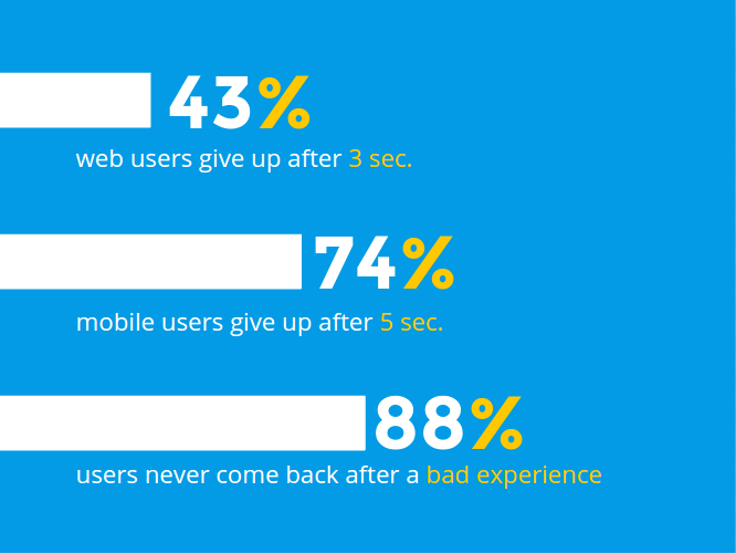
A delay of even a few seconds is enough to drive the users away from an eCommerce platform. It would be good to show a loader instead of showing a blank screen if the response time is considerable. E-commerce platforms should do code optimization to detect the loopholes present in their code. Conducting a code optimization analysis will help eCommerce platforms identify whether their code is redundant or not. Code redundancy is a significant reason for the ample response time.
Infrastructural challenges, complex interface, and inadequate testing made the Healthcare.gov store suffer from slow response time and frequent timeouts. It happened when the unprecedented surge in traffic experienced during the initial days of its launch far exceeded the expected user load.
Lack of clarity in the order Checkout procedure
A complicated checkout process can turn off many users and finally result in cart abandonment.
According to a study, the average shopping cart abandonment rate stands at 87%.
The following things make the order checkout procedure complicated.
- The platform does not show the total order cost upfront.
- Not enough payment methods
- The platform asks for too many unnecessary details.
- Has long forms at the final stage of the purchase
- The product returns policy was unsatisfactory.
A checkout process for an e-commerce platform should be fast and should have an easy-to-understand flow. There are many ways to avoid shopping cart abandonment, but no method can compensate for a poor UI/UX design.
Mentioned below are some things that can aid in making the order checkout process faster.
- Allow the users to save their payment information
- Offer guest checkout
- Make it easy for the users to reset forgotten passwords
- Use progress indicators
- Provide a summary of cart contents
- Provide multiple online payment modes with Cash on Delivery (COD)
Fab.com was an eCommerce platform that initially gained popularity but later faced significant issues related to its checkout process. The overly complex and time-consuming checkout with multiple steps, mandatory registration, limited payment options, and ineffective mobile checkout leads to frustrations for users trying to make purchases on smartphones and tablets. As a result of these issues, Fab.com faced challenges with cart abandonment, reduced conversion rates, and negative user feedback.
Lack of financial security that shakes users’ trust
Lack of confidence amongst users regarding payment security is another major reason for e-commerce platform failure. Nobody is going to buy from an unsecured e-commerce platform.
To instill confidence amongst users regarding payment security, the e-commerce platform owners must take robust security measures like:-
- Payment Card Industry Data Security Standard (PCI DSS)
- Get an SSL certificate for your e-commerce platform
- Multi-factor authentication (MFA)
Another point to note is that if a transaction failure occurs, then there should be a mechanism to ensure its proper handling. The user must get a clear message that a transaction failure has occurred. There should be an alternative payment gateway to ensure that the transaction is completed. There should be clear communication regarding the reason for failure and the days in which the failed payment amount will get credited to the user’s bank account.
eToys was an eCommerce platform created during the dot-com bubble era. While it gained popularity at the time, but later faced payment security issues due to a lack of encryption, data protection, and payment security measures. The security vulnerabilities eroded customers’ trust in the store and became one of the reasons for the store’s decline.
Essential functions out of thumb’s reach
Putting key functionalities out of the thumb’s reach is one of the most common mistakes that e-commerce platforms make. According to a study conducted by mobile expert Steve Hoober, most people use one hand while operating their smartphones. The result of Steven Hoober’s study
- One-handed: 49%
- Cradled: 36%
- Two-handed: 15%
This study indicates that by keeping critical functions out of the thumbs’ reach, the web app builders make the user experience difficult. If too many functions are out of thumb’s reach, then it shows a lack of proper UI/UX design planning. The smartphone screens are getting larger, making it difficult to operate a smartphone with one hand. Larger screens also mean more challenging access to areas that are further out of the thumb’s range.
Toys.com was an eCommerce platform specializing in toys and children’s products that faced criticism and usability issues, including challenges related to essential functions. The store was not well-optimized for mobile devices, resulting in a poor user experience for users accessing the site on smartphones or tablets, as functions were not easily accessible on smaller screens. Besides, the important calls to action, such as “Add to Cart” buttons and checkout options, were not prominently displayed and buried within the website’s cluttered design.
Another example is the Walmart website, where there were two buttons: a green add-to-cart button and a grey view details button for items out of stock. Walmart removed the out-of-stock button and kept only one add-to-cart button. This simple step of keeping one clear CTA helped increase the conversion rate because the customers knew that the items they were using were available online, providing them with an incentive to purchase them. These little changes increased Walmart’s conversion rate by 20% and helped in doubling mobile e-commerce sales.
Ineffective search feature
Many e-commerce platforms ignore the search feature and give away an excellent opportunity to improve their conversion rate. Through the search feature, the users can simply type the product they are searching for and quickly check out instead of looking around the website. E-commerce platforms should ask the following questions to themselves while designing the search feature.
- Is the feature helping users in finding the product they are looking for?
- Does the search feature enable users to discover new products?
- Is the auto-fill feature working correctly?
- Is the search bar easily identifiable?
Make sure all the functionalities like- the search bar perform as they are intended for. That’s why e-commerce consultants always suggest businesses to consider and select features during Ecommerce platform selection to identify whether it provides all the functionalities that they need to go online or optimize it.
J.C. Penney, a well-known American department store chain, had a mobile app that faced usability issues, including problems related to poorly designed search functionality. The search functionality within the mobile commerce app was often inefficient and did not effectively help users find products, further frustrating users trying to locate specific items.
Improper design of Ecommerce Platforms
A cluttered or poorly designed website can overwhelm users, making it challenging for them to find the products or information they are looking for. It creates a negative user experience and frustration. Such poor UI/UX design can quickly put an e-commerce business into the list of online shopping companies that failed.
Grainger.com has an excessively complicated password creation procedure that repels users from the site. According to a study conducted by baymard.com, around 7 out of 10 sites have overly complicated password creation requirements, forcing many users to use a password that they won’t remember later. The study also found out that 1 out of 5 customers will abandon the cart due to extensive and strict password rules.
A balance should be created between letting the users set a strong password and creating a password that they won’t forget later.
While ordering stuff from e-commerce platforms, the delivery date is a significant concern. A common mistake that many e-commerce platforms make is that they do not state the delivery date clearly. Baymard found out that 34% of Sites Use ‘Delivery Speed’ Instead of ‘Delivery Date’.
For instance, many sites use the term.
Delivery speed
Standard: 2 business days
It is ambiguous because the users have to calculate the date when they will receive their shipment. Instead, the e-commerce platforms could choose to display the delivery date directly or display a date range.
Delivery date
By stating the delivery date directly, the e-commerce platforms can reduce ambiguity and make the consumer experience smooth.
The study by Baymard also found that 7 out of 10 sites do not allow users to edit data directly at the order review stage. The edit links send the users backward and cause confusion and frustration. The constant back and forward movement make editing even simple typing mistakes, which becomes a harrowing experience for the users.
Wrapping up
The key to growing e-commerce sales is simple, create a memorable shopping experience. To achieve this, your e-commerce business must continuously adapt to the changing needs of the consumers. We hope that this article will help e-commerce platform owners avoid costly mistakes and help answer how to make your online shopping platform successful.
 Avantika Shergil
| Oct 4, 2023
Avantika Shergil is a technology enthusiast and thought leader with deep expertise in software development and web technologies. With over 8 years of experience analyzing and evaluating cutting-edge digital solutions, Avantika has a knack for demystifying complex tech trends. Her insights into modern programming frameworks, system architecture, and web innovation have empowered businesses to make informed decisions in the ever-evolving tech landscape. Avantika is passionate about bridging the gap between technology and business strategy, helping businesses build customized software and website, and understand about different tools to leverage effectively for their ventures. Explore her work for a unique perspective on the future of digital innovation.


