While building a website, businesses put a lot of effort and time into making the content right, enabling mobile responsiveness, and creating the best UX design to improve search engine rankings. It brings a massive audience to the website and easily finds what they are looking for. But is it enough to make the users reach out to the product/service page they need?
All such efforts help increase the number of leads, but conversion relies on how easily visitors find what they are looking for. You got it right. It’s website navigation that enables users to access the website functionalities and makes them feel confident about business offerings.
Creating helpful user experiences and increasing conversion rates requires the best navigation design. This blog will briefly explain more about website navigation, the importance of a well-organized navigation structure, and the types of website navigation that businesses can consider followed by top website navigation trends. The best practices for unmatched website navigation, along with a few examples of who gets the navigation right, are explained in detail.
Table of Contents
What Is Website Navigation?
Designing for usability means designing for people’s needs and desires.
The famous quote goes well with website navigation, wherein the path to reach out to the products/services must be well-organized and well-defined. The navigation structure guides the users in moving around the website effortlessly and reaching their needed page or section. The website menu design is a part of website navigation containing links that allow users to reach different pages and easily get back to the home page without much ado.
The logical flow and descriptive labels stay at the heart of the best navigation that allows first-time visitors to go around the website hassle-free.
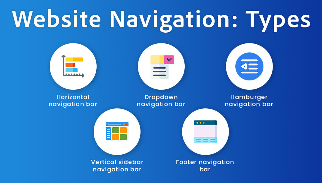
5 Different Types of Website Navigation
Users scan rather than read, so make it easy for them to find what they are looking for. There are different ways to organize the website content using one of the several types of navigation structure. Top web design companies help businesses make the right choice based on website type, content, and targeted users’ browsing preferences.
Horizontal navigation bar
Traditionally, horizontal menu navigation is leveraged at scale, which is placed at the top of the website in a horizontal line. Placing menu items at the top improves their visibility and allows users to quickly reach out to the pages.
For example, the TopDevelopers.co website showcases menu items at the top that make it easier for users to find out services or resources they offer.
Dropdown navigation bar
Dropdown navigation style is used in conjunction with horizontal or vertical navigation style. Dropdown menu items are placed in the main category tab, just like in horizontal navigation. And when users click on one category, the complete dropdown menu shows up with links to all service/product pages.
When users click on any of the main categories, say service page, sub-categories with more options appear on the screen. This way, horizontal navigation can accommodate more links. The hierarchical navigation style makes content quickly accessible to website visitors.
Hamburger navigation bar
If businesses are looking to save little space on their website for navigation, the hamburger navigation menu style stands out. It’s a hidden menu that pops up when you click or tap on three parallel lines shown at the left-top corner of the website.
For example, amazon supports hamburger navigation that displays menu items after users click on three parallel lines. Although the hamburger menu is positioned anywhere on the website, it is not kept in the most viewed place; they go unnoticed, and users fail to access your offerings.
Vertical sidebar navigation bar
The vertical sidebar navigation menu is popularly used by Ecommerce websites where the navigation menu is placed vertically along the left-hand side of the website. Such navigation showcases various sub-categories and makes content more accessible.
Menu items in vertical navigation allow users to access and find what they are looking for easily. As vertical scrolling is more effortless compared to horizontal navigation, businesses can add more menu items.
Footer navigation bar
Footer navigation is commonly witnessed at the bottom of every website that showcases the links to all the important pages and top services of the website.
For example, the Footer navigation of the service provider’s website displays links to all services they offer, white-label solutions, company information, and hire developer pages.
5 Rarely Known Advantages of Website Navigation
Good navigation makes people confident about browsing the brand’s products or services. It’s just the tip of the iceberg. The customers recognize good navigation which brings a lot more benefits to the businesses.
Websites become more accessible
After reaching out to the home page, when website navigation is well-organized, fewer customers leave the website without heading to the second page or taking any action. Customers easily get to know where to go or what to do, which, in turn, reduces the bounce rate. It showcases good navigation, making the website quickly accessible and helpful to customers.
Enhance the navigation experience
The great experiences make the website memorable. When website users get to the page they are looking for in the reduced time; they are likely to visit it again because of the experience they gained during the first visit. The appropriate directions with proper navigation structure assist users in moving around the website glitch-free. It leaves an indelible impression and delivers a good experience to the users.
Increase conversion rate
When website navigation is planned wearing the users’ lens, it creatively meets users’ needs for navigating through the website. One-time experience of the best navigation retains users, which proportionately surges conversion rates.
High responsiveness to CTAs
Easy navigation makes the lives of the users easier as when they reach out to the page in a reduced time; they can spend more time browsing other relevant pages of the website. In such cases, users are highly responsive to CTAs. That’s where businesses get an opportunity to build relationships with users. CTAs attract the website visitors attention to click on it and take them to the place on website that they were looking for or should look for.
Improved SERP
Optimal website navigation improves user experience and increases the visit duration, which ultimately translates into high conversion. Google considers visit duration, bounce rate, and user experience for ranking websites. The positive impact boosts the SERP rate of the website on search engines.
Best Practices to Follow While Creating Website Navigation
The benefits of website navigation are reaped only when it is well-crafted following a couple of tips and the best practices. Go through the given best practices for creating user-friendly website navigation.
Add a search bar at the most viewed place
Website navigation’s hierarchical structure allows users to move around business offerings, but the search bar is equally important to let users quickly find what they are looking for. Some websites struggle with poor visibility due to improper positioning of the search bar that goes unnoticed by the website’s visitors. Such situations are prevented when the search bar is kept at the top right or left corner of the website page.
Select website navigation type intelligently
The five types of website navigation styles discussed above fit well for specific types and sizes of business websites. Some websites use one type of navigation, while some use a combination of 2-3 types of navigation structures. When confused to make a decision seeking the advice of web development companies is good as they recommend the best navigation types after understanding website offerings before website designing starts.
Leading websites use a maximum of three types of navigation, but not more than that because it increases complexity and confuses visitors. Professional web designers put a fair number of web navigation elements that accommodate most of the page links.
Choose menu titles that define itself
Titles given to the navigational menu must be simple, easy to understand, and self-determine the purpose of the linked navigational link. The self-explanatory nature of menu titles makes it easier for users to access the products or services they are looking for.
For example, sub-category titles in the navigation menu of the Ecommerce website self-explain the users about the product they need in a single click. Trending T-shirts, apparel, or other titles are self-defining. Keeping titles using the words from users’ vocabulary, the chances of getting the pages found and SEO score are high.
Keep navigation simple
Just like more options confuse customers during shopping, similarly, making the design complex with several elements in website navigation frustrates users and lets them move away. Keep the web navigation simple by including only important navigational links and buttons.
Striking a balance between visitors’ needs for navigation and necessary links ensures that they can easily get around the website hassle-free.
Avail of footer optimally
The footer is a secondary navigation area that website visitors look for the most after the top navigation area, as it’s convenient to access important links. Also, there’s a fact that when users reach the bottom of the website after scrolling a lot, it indicates that they are interested in the website’s offerings. That’s where utilizing the footer- ‘above the fold space’ helps highlight valuable content.
Here, the navigational links that cannot be kept in the header are included within some categories. This practice ensures vital page links get added and keeps the users engaged in the website.
Prioritize mobile experience
As 60% of users access websites through mobile, it’s essential to build a responsive website. It means the website navigation menu must be optimized for mobile screen sizes so that users can view navigation menus on mobile clutter-free.
For example, a horizontal menu is difficult to read and use on mobile devices, so implementing an expandable menu makes the menu accessible and user-friendly.
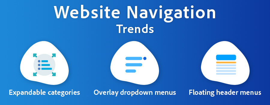
Website Navigation Trends That Are Worth Considerable
The practices and tips help build the best website navigation structure, but it must be modernized with the implementation of creative design, current trends, and much more.
Expandable categories
The mobile screen provides little space for businesses, which requires making the website accessible with a simplified navigation structure. In this case, business websites on mobile view require keeping expandable categories in full-screen mode so that an endless list of links that are implausible to add to a single menu is organized sensibly.
Expandable categories display the menu items in a hierarchical tree structure wherein multiple sub-categories with different options are displayed under the main category.
Overlay dropdown menus
Not all the links in the dropdown menu are clickable, which confuses users during website navigation. Dropdown menus work well on larger screens such as desktops because designers can eliminate the confusion with a color overlay on the main menu. Rather than opting for a hierarchical and local navigation structure, the overlay dropdown brings users’ attention to the menu.
Floating header menus
In the last decade, the floating header menu has gained high traction and is expected to continue in the years to come. The floating header menu sticks to the top of the website irrespective of how much users scroll down. The fixed position of the website navigation menu ensures users can have constant access to the menu, making internal navigation easier.
It works amazing for websites with lengthy pages because quick access to navigational links delivers the best user experience and drives conversion.
Ready to Implement the Best Website Navigation for Your Business?
Improved focus on UI/UX is one of the top modern web design trends, that’s now highly considered. Under the UI/UX umbrella, it’s well said that well-organized websites are easier to navigate than poorly organized ones. Clear navigation menus with content categorization and consistent formatting optimize the website navigation for users. Recognizing the importance of navigation, best practices, and the latest trends will help businesses implement the right website navigation type in sync with their offerings and target audience browsing patterns. Craft flawless experience for users with simple and seamless website navigation.
 Derek Cohen
| Apr 1, 2024
Analyzing business activities and data to formulate the best business development ideas is where I earn appreciations and remunerations. I’m an ardent reader, business adviser, gadget aficionado and an amateur yet an avid writer. My urge for innovative writing evokes every time I come across new gadgets, neo technology and novel technical events.
