The User Experience and User Interface are two of the most important factors determining a website and mobile app’s future. No matter how good your website or app is, it won’t be able to achieve its full potential if the users find it difficult to use.
Preparing wireframes is a technique that helps the designers gain much-needed clarity on the website and mobile app’s design. The clarity gained through wireframes helps UI/UX designers to remove unnecessary design elements in the planning stage itself, saving a considerable amount of time and energy.
Due to lack of knowledge about building good Wireframes, many people often neglect its importance.
Here is a detailed guide that will help you to get insights about the process of wireframing, types of wireframes, tips to improve your wireframes to develop high-quality user-friendly software, web and mobile app design, and more.
So let’s get started!
Table of Contents
- What is a Wireframe?
- Why invest in a Wireframe?
- Types of Wireframes
- Wireframes for Different screen sizes
- Practical Tips to Create an Efficient Wireframe
- Things to Consider Before You Start Wireframing
- Set Clear Expectations
- Consider Device Support
- Go ahead with Low Fidelity
- Design the Navigation
- Show the Information Hierarchy
- Enlist Feature Requirements
- Use Annotations
- Collaborate and Gather Feedback
- Iterate and Refine
- Collaborate to Create
- Follow an Iterative Process of Updating
- Consistency is the Key
- Respect Deadlines
- Weed out the Inessential Stuff
- Color-Less
- Lorem ipsum is Not Okay
- Backup Everything
- Feedback Have Your Back
- Test your Wireframes
- Get Customer Approval
- How to Create a WireFrame: Step-by-Step Guide
- The Best Tools for Wireframing
- The Final Touch
What is a Wireframe?
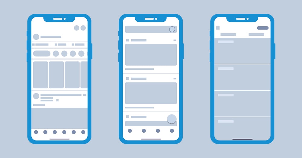
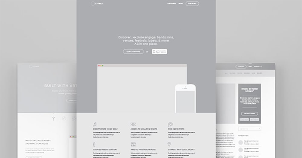
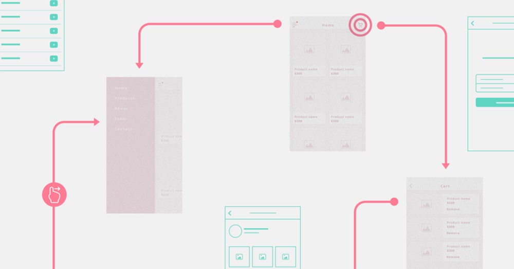
A wireframe is a visual representation of a user interface that serves as a blueprint for a website or mobile app. They are created during the early stages of the design process to outline the structure, layout, and functionality of the interface without getting into detailed visual design elements like colors and images.
Wireframes are intentionally simplistic and often use basic shapes, lines, and placeholders to represent elements like buttons, text, images, and navigation. They focus on the arrangement and hierarchy of content and user interface elements. It helps define how different components relate to each other within the interface and where they will be located.
Why invest in a Wireframe?
Wireframe is the graphical presentation of how the various aspects on the screens will be displayed to provide a better understanding of the flow. It is a well-known fact that visual content is appreciated more by the audience. Humans are visual beings, and we are biased toward anything that “looks” beautiful.
You can exploit this visual bias of humanity to your benefit by building an app and website with a great design. The design of a website and app may go through many changes before it is finalized. It becomes costly and cumbersome if your designers have to rebuild the design multiple times.
It is where the role of a wireframe proves useful. Consider Wireframe as a blueprint for your website and app. While it is not the final version of the design, it gives the UI UX designers and anyone looking at it, a bird’s eye view of the proposed design.
Wireframes save you the hassle of redesigning the website/app at later stages. You can check the wireframe in the initial stage of the development process and provide suggestions to implement as per your requirement to save time.
Once the wireframe is finalized, you can then speed ahead with designing the website and Application. Thus, by choosing to invest early on in a wireframe, you can save time and energy and finish the project faster.
Now that we understand the importance of building wireframes, let us get some basic understanding of wireframes.
Types of Wireframes
The UI/UX designers take various approaches while building wireframes. The simplest method of building a wireframe is the old-school paper and pencil method. By sketching a wireframe from your mind to the paper, but this might lack the detailing required in many projects these days.
There are three types of wireframes and each one is an extension of the type that precedes it. The type of wireframe opted for depends on the phase of the planning stage.
Low-fidelity wireframes (Low-FI)
These are the wireframes that are the simplest type. A low-fi wireframe is created literally in the most basic form by either using hands or some basic tools. A low-fidelity wireframe is believed to be as minimalistic as possible.
Mid-fidelity wireframes
A mid-fidelity wireframe is a little more detailed as compared to the Low-Fi and steps closer to the final UI design. In this type of wireframe the layout and the interaction between the pages on how a user would proceed is much clearer.
High-fidelity wireframes (High-FI)
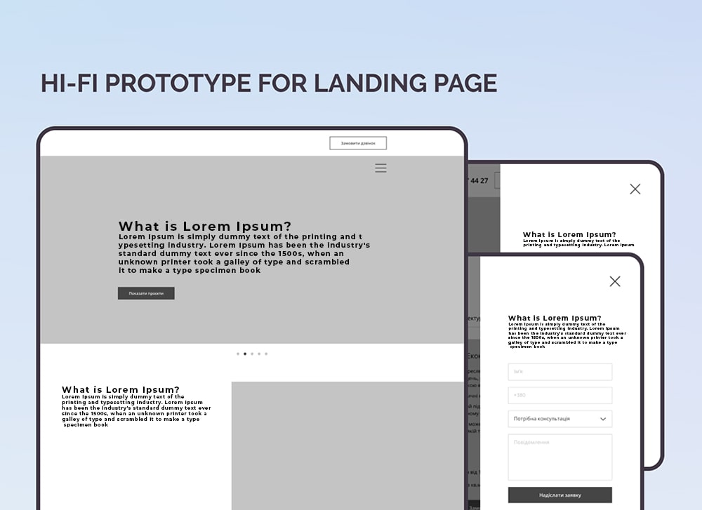
High-fidelity wireframes are the closest to what a final UI design will look like. In this type of wireframe, all the UI elements, fonts, colors, buttons, images, icons, and backgrounds together form a perfect combination that can be turned into a working prototype.
E.G. A low-fi wireframe is ideal for showing the place of the elements on a page, the high-fi wireframes show you the user’s journey through the interaction of different elements within your app or website.
Wireframes for Different screen sizes
While the wireframes will be the same, you will need to take either a top-down or a bottom-up approach to building the wireframes according to the screen’s size.
While building the wireframes, you should keep in mind the various devices like tablets, desktops, and smartphones that your users will be using.
It is important to think about the kind of device because it helps you set your priorities right. If designing for a mobile wireframe, you need to decide about the cards and elements you will need to stack as users scroll the small screen. If designing for a desktop wireframe, you will have the luxury of space, allowing you to design accordingly.
One should always recommend the time to create wireframes for different devices and screen sizes for user interaction. It will help you and your dedicated team to increase the user experience (UX) of your targeted audience.
Practical Tips to Create an Efficient Wireframe
Now that you have a basic idea about wireframes let’s move on to seeing a few tips that will help you create exceptional and effective Wireframes.
Start by Focusing on the User Research
Who is the user?
Before starting any project, you must ask the following questions to yourself.
- Who is going to use this website and mobile application?
- What challenges is the user-facing?
You could use various methods like focus groups, surveys, or online social media polls to find answers to the questions mentioned above. By understanding the type of person who is most likely to use the digital product, you will visualize all the obstacles and opportunities in advance.
What does the user want?
Once you are clear about who your user is, you should start thinking about the experience that a user expects from the digital solution. A very important pitfall to avoid while thinking about user experience would be that of the “creativity trap.” Understand that the user is not on the website/app to see your creativity skills; he/she is here to seek a solution to the problem and solve it fast.
Hence it would help if you always asked these questions to yourself,
- How is this design element going to help user?
- Which information is the most valuable one for user?
- Which tasks does user wish to accomplish?
By constantly reviewing your design against the questions mentioned above, you will ensure that your dedicated UI/UX design team stays on the right track and is focused on increasing user experience.
Use a Properly-Sized Canvas
One of the most basic mistakes that designers make while designing a wireframe is selecting the wrong canvas. You will waste a lot of time making corrections to your design if you choose an improperly sized canvas. A wrong canvas will lead to the wrong density of elements, ultimately leading to an incorrect visual hierarchy.
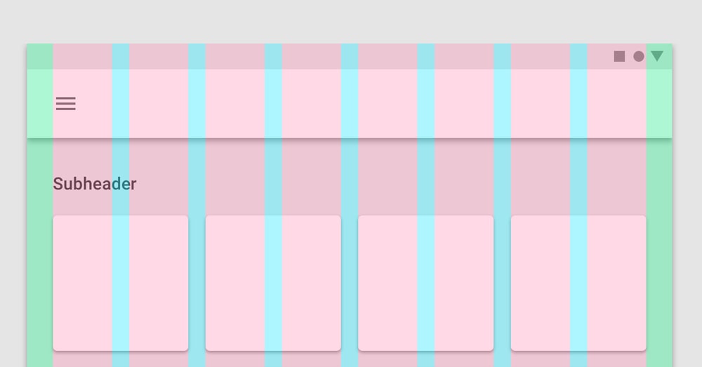
Grid-It Out
Using a grid system, you will ensure that the layout elements are adjustable, scalable, and interchangeable. Thus, allowing us to build the wireframe fast.
Think in Terms of Flow, Not Individual Screens
UI/UX Designers often get trapped in the nitty-gritty of design and tend to ignore the user’s journey on the website/app. There are high chance that a small font or color change would go unnoticed by the user, but a disarrayed flow won’t. Think in terms of user interaction while designing, and you will ensure a seamless experience for the user.
Ask the following questions to yourself while designing every screen.
- What is the most important design element on this screen?
- How will the users interact with this design element?
- What do they expect to see next?
Don’t Get Too Attached to Your Wires
Wireframes are meant to go through many changes, and emotional attachment to the wireframe can prove to be detrimental to the project. Be open to the changes and pivot often as an emotional attachment towards your ideas can limit your creativity and prove to be an obstacle in building a great design.
Make It Functional, Not Pretty
Wireframing is all about rapid creativity and not about design details.
We understand that anything that you build “must” look beautiful. But keep in mind that the purpose of wireframing is to convey the idea with minimal details. By spending too much time on making the wireframe “beautiful,” you will lose precious time, defeating the very purpose of building a wireframe.
Things to Consider Before You Start Wireframing
Before you start wireframing a user interface, there are several important considerations and best practices to keep in mind to ensure a successful design process. Here are some key things to consider:
Set Clear Expectations
Begin by defining clear business project goals, objectives, and user requirements. It helps understand the purpose and scope of the interface to design that further guides the wireframing process effectively.
Consider Device Support
Determine the target devices and platforms for the interface. Consider whether you’re designing for desktop, mobile, or both. This decision will influence the layout, responsiveness, and usability of wireframes.
Go ahead with Low Fidelity
Start with low-fidelity wireframes before moving on to high-fidelity designs. Low-fidelity wireframes focus on the structure and layout without delving into detailed visual design elements. This approach allows iterating quickly and exploring different concepts.
Design the Navigation
Plan and design the navigation structure of the product interface, considering user flow to ensure that navigation is intuitive and efficient. Define how users will move between pages, sections, or screens.
Show the Information Hierarchy
Clearly indicate the hierarchy of content and functions within wireframes. Use visual cues such as size, placement, and grouping to convey the importance and relationships between different elements.
Enlist Feature Requirements
Identify and prioritize the features and functionalities that need to be included in wireframes. Ensure that the core user needs and goals are addressed while avoiding feature bloat.
Use Annotations
Annotate wireframes with explanatory notes or comments. They provide context and help team members and stakeholders understand design decisions. Explain the purpose of specific elements and interactions.
Collaborate and Gather Feedback
Wireframing is a collaborative process. Involve team members, stakeholders, and potential users in reviewing and providing feedback on wireframes. This feedback is invaluable for refining product design.
Iterate and Refine
Wireframing is an iterative process. Be prepared to make revisions and refinements based on feedback and user testing. Continuously evaluate and improve wireframes as you progress through the design stages.
Collaborate to Create
Instead of limiting yourself to only the designer’s perspective, involve other team members, like content strategists or accessibility experts, in the design process to create an ideal wireframe. The collaboration of different team members will ensure that the wireframe benefits from your team’s diverse expertise.
Follow an Iterative Process of Updating
Based on the stakeholders it is best to take an iterative process to develop a Wireframe. In the process of updating the wireframe based on regular brainstorming sessions, you have with your team and the requirements to be taken care of with respect to the end-user personas you take into consideration.
Consistency is the Key
The human brain loves certainty, and to express certainty in design, you need to be consistent. Colors, fonts, spacing, and shapes should be consistent throughout the website/app.
Be clear and upfront about the design elements that need to be included and the ones that will be omitted from the wireframes. It will create clarity among all the team members. Also, it will ensure that everyone is on the same page.
Preparing a legend or index of the shapes, fonts, colors, elements, and spacing will let everyone involved in the project know what-represents-what in the wireframes. It will avoid confusion later.
Respect Deadlines
Since the project needs to be developed on a tight timeline, wireframe designs also need to be completed within a deadline. One of the most crucial factors essential for building better wireframe designs is respecting deadlines, because it will help you to send progress reports to clients for necessary approvals of changes and updates.
Have strict deadlines for every stage in the design and make sure to follow these deadlines.
Weed out the Inessential Stuff
Do not think about multiple steps ahead while developing wireframes and focus only on one screen at a time. This will help you to be clear on the essential aspects that the screen needs to convey to the user. This way, you will be able to weed out the inessential stuff, making the user experience much better. Also, it will help designers and developers to seamlessly connect other pages and features in the wireframe.
Color-Less
Avoid using colors in wireframes and keep it clean and simple. While building the wireframes, do not be concerned about using color, but about depicting the user’s journey’s basic details in the clearest possible manner. By avoiding color, you will ensure that the process of building wireframes is clutter-free.
Even if you decide to use some colors to differentiate the necessary elements in wireframes for pages or applications, i.e. menus, Call to Action buttons, prepare an index or legend depicting the use of color showing the purpose.
Lorem ipsum is Not Okay
While Lorem Ipsum, aka placeholder copy, is okay for the early stages of content planning, it should not enter the wireframing stage.
Including real content with the help of content strategist or writer, rather than placeholders. This will ensure that the design elements are properly aligned across screens and devices. Also, it will help to see page structure and user’s reading experience
Backup Everything
Take a backup of every single design change while wireframing. It will help in case your wireframes get deleted accidentally and allow you to learn from your old wireframes. By taking backups, you will ensure that you will be able to see the evolution of your project in the future.
No matter what methodology you use, whenever you make even a slightest change or adjustment in the wireframe, save a copy of it. This will help you and your team to learn about the journey of your product, service, user, client, and much more.
Feedback Have Your Back
Step outside and ask for feedback wherever possible. It allows to see things from new perspectives, which is the gist of creativity for product.
When your final wireframe is ready share it with client before starting the design and development on it as your client will provide the feedback while keeping their business and its end user in mind.
Test your Wireframes
You can apply common testing methods like A/B testing, user testing, and observation to test your wireframes. Testing will help build more functional wireframes and iron out the small mistakes that might have crept in. It will provide an idea of how the user will use the app and website, and what will be the outcome of the design. You can also provide valuable insights to your client related to suggestions and updates in their requirement which they might have missed early.
Get Customer Approval
Customer approvals are essential in many wireframes design and development. By sharing the various iterations of the wireframes with your clients, you will ensure that you are on the correct path. The approach also ensures that the project is finished in time.
How to Create a WireFrame: Step-by-Step Guide
Creating a wireframe is an essential step in the design process for websites, mobile apps, and other digital products. Here are six steps to make a wireframe that outlines the structure and layout of a digital interface:
Define the Project Goals
The team begins by first understanding the digital project’s goals and its target audience. After that, key features and content that need to be included in the wireframe are identified. All of the information and any available project documentation are stored in one place to create a central repository for single-view data.
Research and User Analysis
Once the business objective for creating digital products is clear, the next step forward is conducting user research to gain insights into user preferences, behaviors, and needs. It helps to create user personas to represent the target audience. Consider user journeys and scenarios to understand how users will interact with the interface.
Sketch Rough Ideas
When all research data is ready, start with rough sketches on paper or a whiteboard. These sketches should be quick and low-fidelity, focusing on the layout, content placement, and overall structure. Also, sketch multiple variations to explore different design concepts.
Create Digital Wireframes
Choose a wireframing tool such as Sketch, Figma, UXpin, Justinmind, or Mockflow, and create digital wireframes based on your sketches. Start with low-fidelity wireframes, which focus on the structure and layout without detailing visual design elements. Place essential UI elements, such as navigation menus, headers, content sections, buttons, and forms, on the wireframe. Placeholders are used for images and text.
Add Interactivity and Annotations
Depending on the complexity of the project, you can opt to add interactivity to wireframes. For example, arrows or lines are used to indicate user flows and interactions. Include annotations or notes to provide explanations and context for specific elements or interactions. Annotations help stakeholders and team members understand decisions taken in regard to element leverage or its placement.
Review and Iterate
Remember that wireframes are a flexible and iterative part of the design process. They should evolve as the project progresses and accommodate changes. Share wireframes with team members, stakeholders, and potential users for feedback. Collect feedback and make revisions based on the input received. Continue to iterate wireframes and gradually enhance the level of detail as you move from low-fidelity to high-fidelity wireframes.
The Best Tools for Wireframing
There are some excellent tools to create a wireframe design that results in UI/UX design. Each of these tools has its unique features and strengths, making them suitable for different design preferences and project requirements.
Here’s a brief overview of each tool.
Sketch
Sketch is a popular vector-based design tool primarily used for creating user interfaces, including wireframes, mockups, and high-fidelity designs. While it’s not exclusively a wireframing tool, it offers robust features and plugins that make it suitable for wireframing and UI/UX design.
- Sketch’s vector-based approach allows for the creation of scalable and resolution-independent wireframes.
- Allow organizing wireframes into artboards, making it easy to manage multiple screens or pages within a single document.
- It helps create reusable symbols and design components, which can be especially helpful for maintaining consistency in wireframes.
- A vast library of plugins dedicated to wireframing and UI/UX design to extend functionality for wireframe creation and interaction design.
Moqups
Moqups is a web-based wireframing and prototyping tool known for its simplicity and collaborative features. It’s designed to help UI/UX designers and teams create wireframes, mockups, and interactive prototypes efficiently.
- Moqups is accessible directly through a web browser, making it easy for teams to collaborate in real-time.
- Multiple users can work on the same project simultaneously, making it ideal for remote collaboration.
- This wireframing tool supports both low-fidelity wireframes and high-fidelity mockups.
- Create interactive prototypes by linking pages or wireframes together to simulate user flows and interactions.
- Provides templates and stencils for various types of projects such as web design, mobile app design, and diagramming to make wireframing easier.
Figma
It is a robust web-based design and prototyping tool that is widely used for various design tasks, including wireframing, UI/UX design, and collaborative design work. Figma has gained popularity for its real-time collaboration features and robust design capabilities. Here’s how Figma can be used as a wireframing tool;
- Figma runs in a web browser, making it accessible from any platform, including Windows, macOS, and Linux, that allows teams to work on different devices.
- Multiple team members can work on the same Figma project simultaneously. Real-time collaboration provides instant feedback during the wireframing process.
- Auto Layout feature simplifies the creation of responsive designs with auto-adjustment of elements within frames based on content and screen size.
- Enable creating shared styles and design libraries to ensure design consistency across multiple projects. Changes to shared types automatically propagate to all instances.
UXPin
UXPin is a dedicated prototyping tool that excels in UX design, including wireframing and prototyping. It offers a range of features tailored to designers and UX professionals.
- Provides a library of pre-designed UI components that can be customized and added to wireframes, helping maintain consistency and save time.
- Supports responsive design, allowing the creation of wireframes that adapt to various screen sizes and orientations.
- Offers usability testing features, making it convenient to conduct user testing and gather feedback on wireframes.
- Includes features for design handoff, making it easier to access design assets, CSS code, and design specifications required for implementation.
MockFlow
The versatile tool offers a range of features for creating wireframes, mockups, and prototypes. Simplicity, collaboration, and other capabilities make it an ideal choice as a wireframing tool.
- Allow collaborators and stakeholders to leave comments and annotations directly on wireframes, thereby streamlining communication and feedback collection.
- Offers version history and revision tracking to view and revert to previous versions of your wireframes. Therefore, tracking changes and collaborating on design revisions become easy.
- Export wireframes in various formats, including PDFs, PNGs, and HTML/CSS code, with stakeholders through shareable links.
Justinmind
If you are looking for a wireframing tool that aids in creating interactive and high-fidelity prototypes? Your search ends at Justinmind, which is designed for UX professionals who need to simulate user interactions and test the functionality of their designs.
- Support for low-fidelity and high-fidelity enables starting with basic sketches and gradually adding more details, interactions, and animations to your designs.
- Allow to create clickable prototypes with advanced interactions, transitions, and animations.
- Seamlessly integrates with design tools like Sketch and Adobe XD, enhancing the wireframing tool’s compatibility with your existing design workflow.
Uizard
Uizard, is a unique wireframing tool that leverages artificial intelligence (AI) to transform hand-drawn sketches into digital wireframes and prototypes. It’s designed to expedite wireframing process by automatically converting drawings into digital assets.
- Uizard’s AI technology scans and interprets drawings, turning them into digital wireframes.
- It processes sketches almost instantly, saving the time and effort required to recreate wireframes manually in a digital tool.
- Begin with rough, low-fidelity hand-drawn sketches and evolve them into high-fidelity designs as needed.
The Final Touch
Always remember that the key to building a great wireframe is to keep it simple. The purpose of designing a wireframe is to convey the idea of the look and feel of the website/ app in a simple manner. A wireframe helps you identify the page elements, the user flow, and navigation upfront.
Wireframe not only helps in speeding up the development process, but it also aids in reducing the cost of developing a website/app.
 Avantika Shergil
| Sep 26, 2023
Avantika Shergil is a technology enthusiast and thought leader with deep expertise in software development and web technologies. With over 8 years of experience analyzing and evaluating cutting-edge digital solutions, Avantika has a knack for demystifying complex tech trends. Her insights into modern programming frameworks, system architecture, and web innovation have empowered businesses to make informed decisions in the ever-evolving tech landscape. Avantika is passionate about bridging the gap between technology and business strategy, helping businesses build customized software and website, and understand about different tools to leverage effectively for their ventures. Explore her work for a unique perspective on the future of digital innovation.
