In the digital age, your website is more than just a virtual storefront—it’s the face of your business, shaping user impressions from the first click. Each web page acts as a guide, helping users understand your offerings and building credibility. Research shows that 88% of users are unlikely to return after a poor experience, making an intuitive structure and seamless navigation crucial for engagement.
Every page should deliver clear, useful information that supports the best user experience. This approach not only boosts business credibility but also maximizes ROI. To achieve this, it’s essential to include only the most important pages and organize them in a logical hierarchy, making it easy for visitors and search engines to navigate and understand your site’s content.
Having too many unnecessary pages can overwhelm users. Instead, focus on the essentials that align with your goals and provide high-value information. So, what pages does a website need? It depends on the products, services, and information that your business prioritizes.
Explore the types of web pages that add value and decide which ones your website should feature based on your business needs.
Table of Contents
- Types of Web Pages You Can Include in Your Website
- Must-Have Pages That Every Website Needs
- Enable grand entry with the ”Homepage”
- The “About Us” page reveals the business’s uniqueness
- Facilitate easy reach out with the “Contact” page
- The “Product” page tells you more about the offerings
- Get users’ problems resolved with “Service” page
- “Blog” page to stay updated with current news
- The “Privacy policy” page displays that users’ data remains secure
- “Terms and conditions” page to apply
- Good to Have Web Pages for Your Website
- Optional Website Pages That You Can Opt to Keep or Skip
- Create a Website Structure With All the Required Pages
Types of Web Pages You Can Include in Your Website
Typically, the multi-page website has 4 to 10 pages based on business size and type of offerings. Target customers’ analysis, competition research, and market insights help business owners and entrepreneurs to know and understand the pages that their websites should have.
The web pages fall into three different categories. Understanding them will help to choose pages for business website development.
- Must-have pages that are the foundation of the website.
- Great to have pages that provide more information.
- Optional pages that you can choose to keep or skip.
Must-Have Pages That Every Website Needs
Must-have web pages are the essential website pages that form the strong basis of businesses, from SMBs to large enterprises. These are the pages that allow businesses to operate in the digital world efficiently.
Enable grand entry with the ”Homepage”
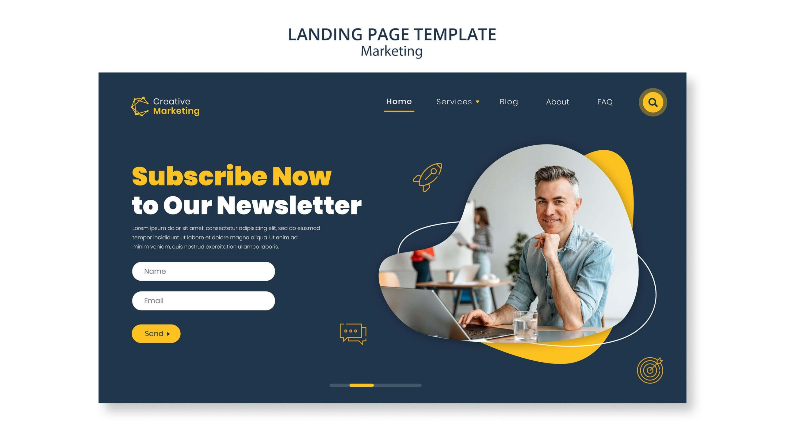
The homepage is the face of the website, and its content and design provide rich insights to users about the business via the website. On the website homepage a design or short video, catchy header, and Call to Action (CTA) that captures users’ attention are enough to keep them above the fold, which entices them to scroll down.
The information below the fold, such as products, services, reviews, and others, must be kept strategically related to the information above the fold. Intelligent placement of design and content makes the visitors interested in exploring the business website further or lets them move to the competition.
Key Elements to Include:
- Clear Value Proposition: A concise statement that showcases your unique offerings.
- User-Friendly Navigation: Ensure quick access to core pages like About, Services, and Contact.
- Compelling Calls-to-Action (CTAs): Direct users to take actions like signing up, booking a demo, or learning more.
- Visual Appeal: High-quality visuals, branding elements, and an intuitive layout are key to making a strong first impression.
Pro Tip: An attractive and organized homepage doesn’t just improve user engagement—it also builds credibility and trust.
The “About Us” page reveals the business’s uniqueness
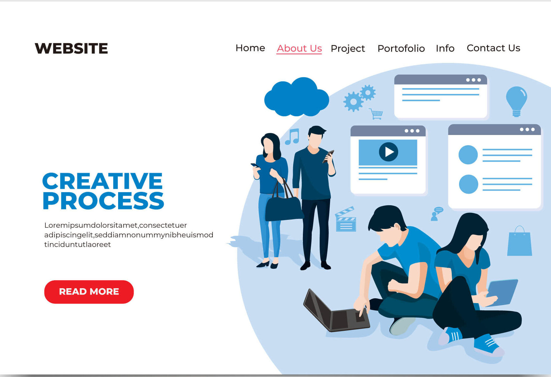
77% of people from the US, UK, France, and Germany use Google to find information about business in local areas. The About Us page lets them know more about the business and how it’s different from the competition. Most new website visitors consider this page first to see the brand story, business vision and mission, team’s background, and other principles that make a business stand out.
Creating an About Us page with customers’ perspectives demonstrating the team’s expertise in advanced technologies that meet customers’ needs is good, rather than boasting about milestones and other achievements, ensuring the business delivers user-centric products/services. The subtle mix of personal information, funny facts, and background personifies the business and enables users to connect with it and see how it’s different from the competition.
Key Elements to Include:
- Company Story: Share your journey, mission, and the “why” behind your business.
- Team Introduction: Personalize your brand with bios or photos of your team members.
- Core Values: Highlight values like innovation, transparency, or customer focus to resonate with your audience.
- Social Proof: Include awards, certifications, or milestones to reinforce credibility.
Pro Tip: Use a conversational tone and include visual elements such as a timeline or team photos to make this page engaging and relatable.
Facilitate easy reach out with the “Contact” page
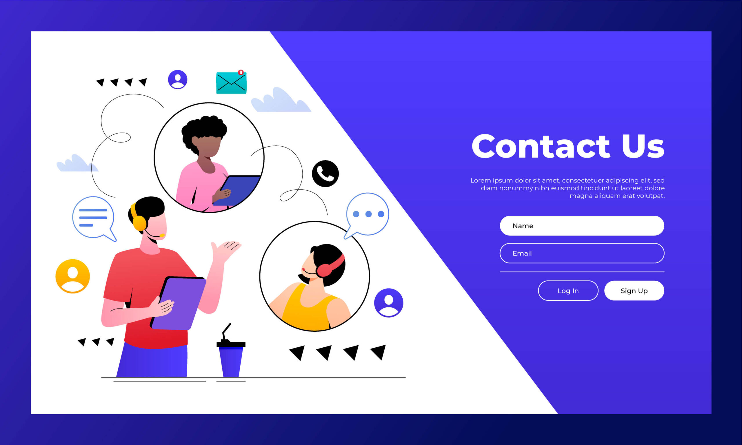
When visitors become interested in the business offerings shown on the website, they will likely contact business stakeholders. The absence of contact information makes them look further or your competitors. It is prevented with a contact page with accurate information to connect with the business. Businesses can add phone numbers, email addresses, social links, live chat, map locations, and even business working hours so that users can reach out to you easily.
The online contact form allows visitors to connect directly through the website, and a captcha prevents spam bots from fooling the system. It enhances user experience and improves user interactions. FAQs and links to a knowledge base are valuable sources for finding information quickly. This way, the contact page provides different ways to connect and communicate efficiently.
Key Elements to Include:
- Accessible Contact Options: Include an email, phone number, and a contact form to cover different preferences.
- Business Hours: If applicable, add operating hours to manage expectations for response times.
- Location and Map: If you have a physical location, embed a map and address to make it easy for visitors to find you.
- Social Media Links: Provide links to your social media profiles to expand ways for visitors to connect with you.
Pro Tip: A user-friendly Contact Us page with quick access to support options shows visitors that you’re committed to providing a positive experience.
The “Product” page tells you more about the offerings
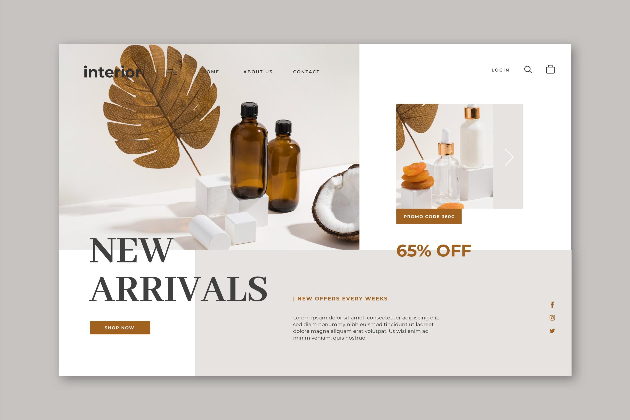
The product page displays the products that the business organization is selling along with its description, option, and advantages. For example, In Ecommerce websites, the product pages include the product’s image, video, description, price, specifications, and others. Ecommerce giants add filters such as brand, size, color, reviews, and others that make product search easier.
Websites with massive products create a product overview page with product categories to facilitate search. Adding links to every product displayed on the product overview page helps online buyers to navigate and reach the relevant product page effectively.
Key Elements to Include:
- Clear Product Descriptions: Provide concise descriptions that highlight each product’s features and benefits.
- High-Quality Images or Videos: Visuals help users engage with products and can improve conversion rates.
- Pricing Information: If possible, include transparent pricing or links to more information.
- Customer Reviews: Add testimonials or reviews to build credibility and provide social proof.
Pro Tip: Ensure each product page is optimized for SEO to increase discoverability in search engines, helping potential customers find your offerings more easily.
Get users’ problems resolved with “Service” page
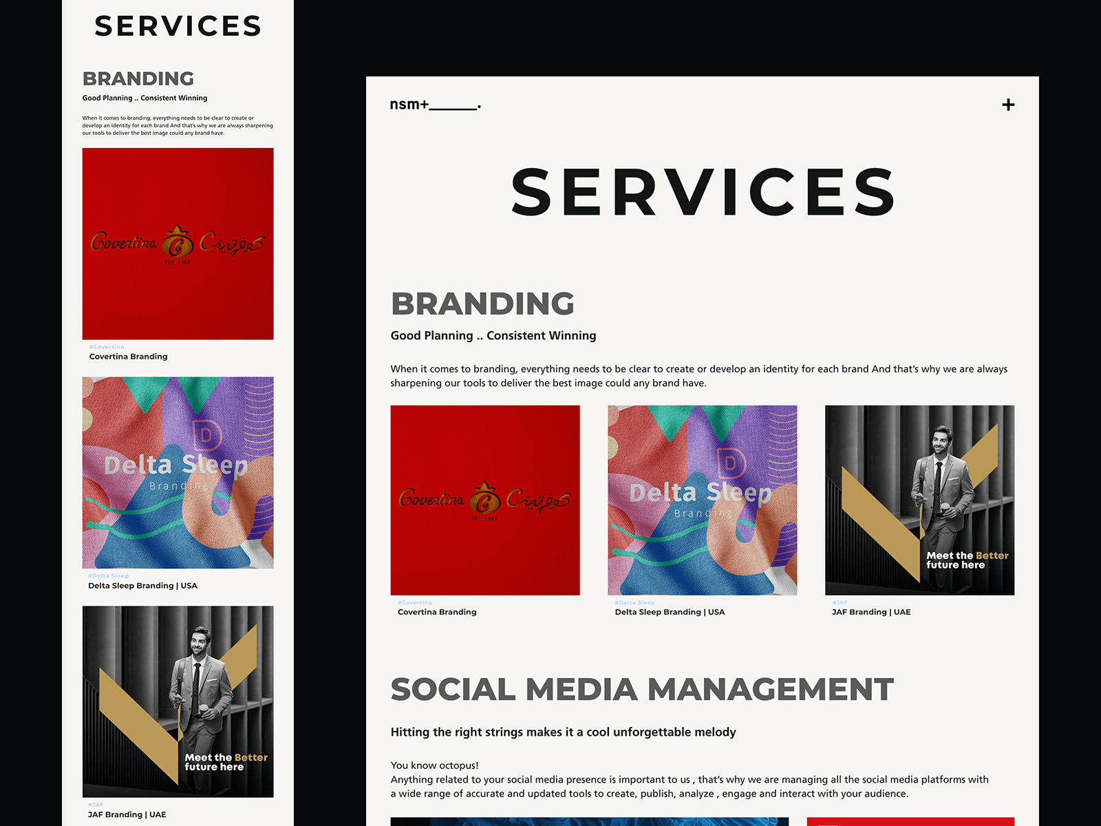
When businesses provide a range of services, organizing them in a way that is easy for visitors to search and digest is essential. When marketing a lot of services, it’s good to create a service page with a brief description of every service alongside a link to the specific services.
Properly structuring this page with icons visually separates different services and makes the description easy to consume.
Key Elements to Include:
- Overview of Services: Briefly explain each service, focusing on how it solves common customer pain points.
- Call-to-Action (CTA): Guide users to take the next step, such as booking a consultation or reaching out for more details.
- Case Studies or Testimonials: Add examples of successful client outcomes to build trust and showcase effectiveness.
- Service Differentiation: Highlight unique features or approaches that set your services apart.
Pro Tip: Organize services by categories if you offer a wide range, making it easy for users to find what’s relevant to them.
“Blog” page to stay updated with current news
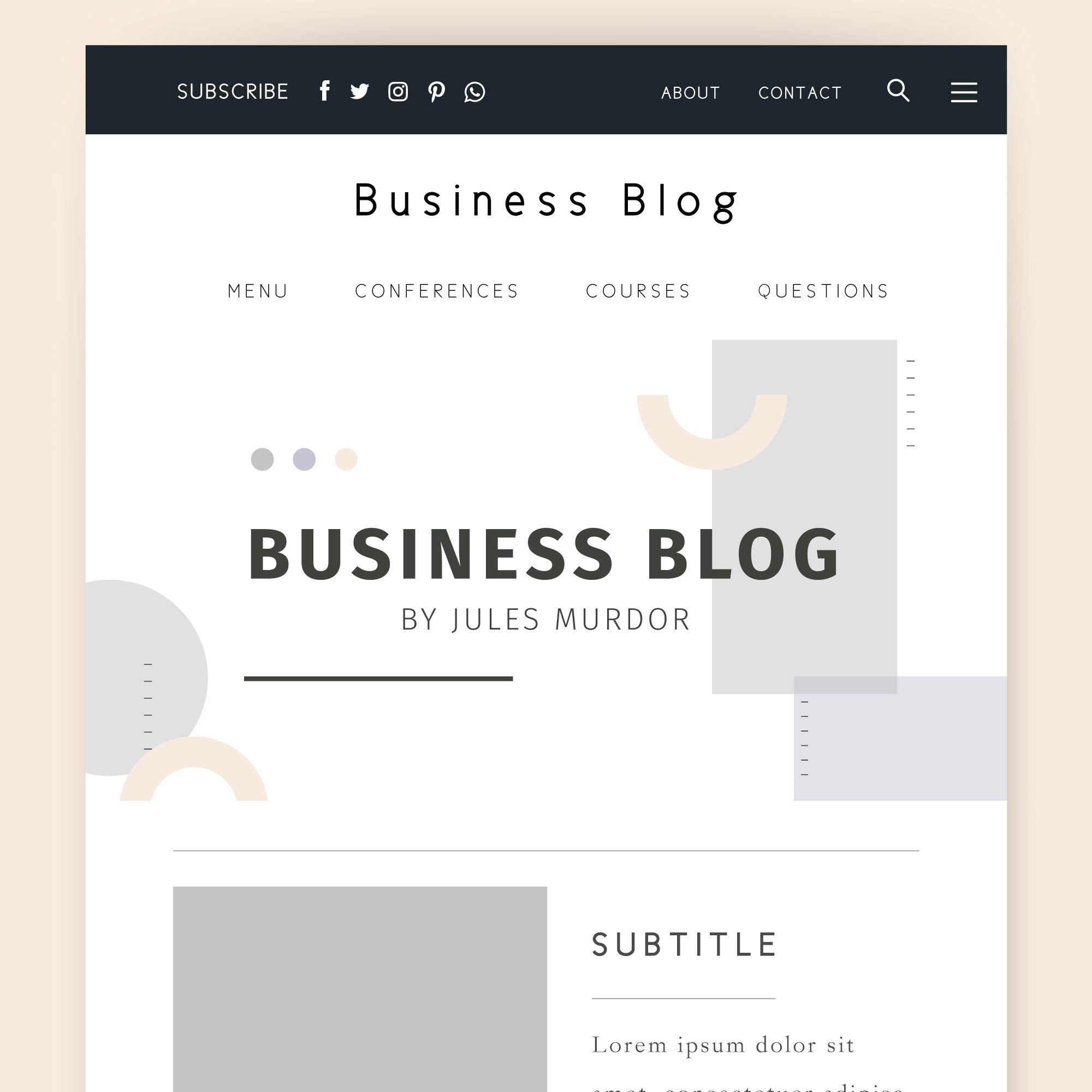
Blogging is a powerful marketing weapon informing readers about the latest trends in the niche industry or customer success story. It’s good to create a blog page wherein all the blogs published are pooled. This web page when includes detailed blogs with relevant information, it generates thought leadership in the market.
Adding CTAs in compelling blogs helps direct users to different product or service pages. In addition to encouraging users to visit the website, search engines also give credence to quality content with optimal keyword density in the blogs, which boosts SERP.
Key Elements to Include:
- Regularly Updated Content: Consistent posting shows visitors that your business is active and up-to-date.
- Categories for Easy Navigation: Organize posts by topics so users can easily find content that interests them.
- Social Sharing Options: Add share buttons to encourage readers to share valuable posts on social media.
- Subscribe Option: Include a subscription box to allow users to get blog updates or newsletters directly.
Pro Tip: Use SEO-friendly headlines and keywords to improve the blog’s visibility on search engines, driving more organic traffic to your website.
The “Privacy policy” page displays that users’ data remains secure
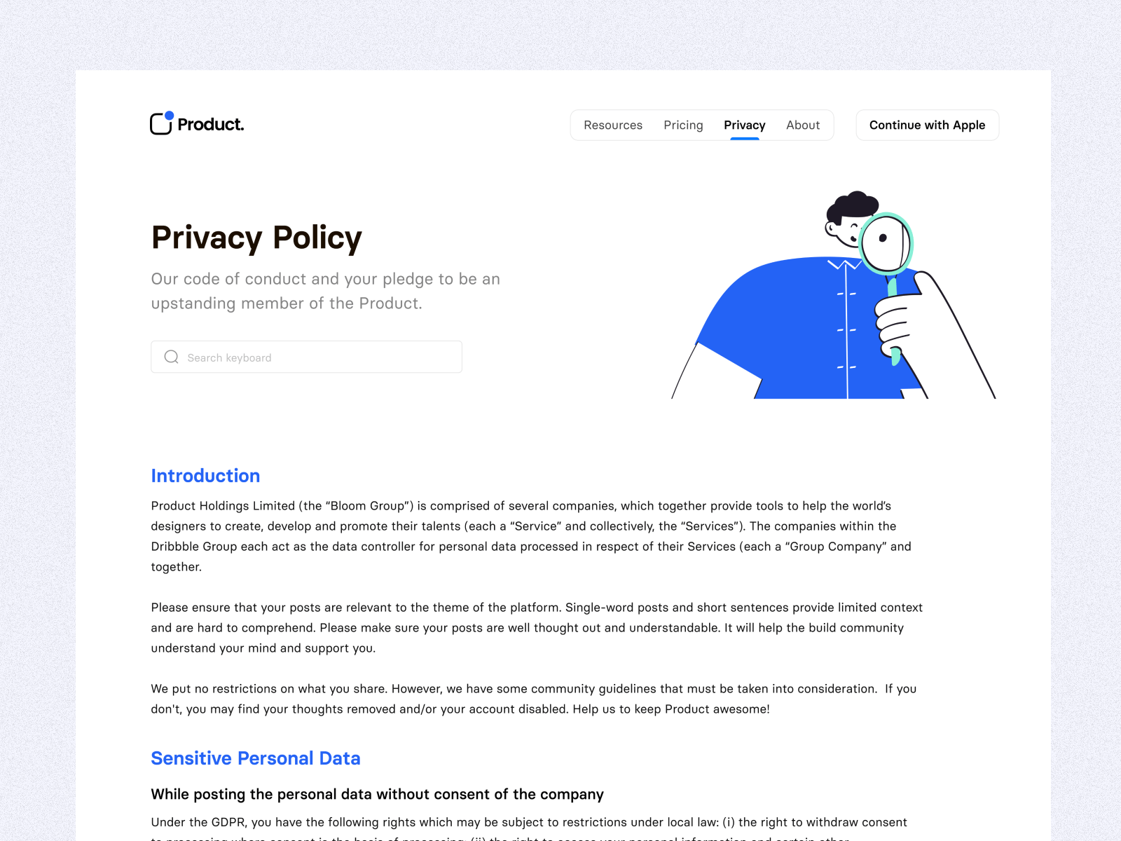
With personal information security rules and regulations such as GDPR, data collection and handling on the website has become crucial for businesses. The businesses need to reveal which data is collected and how it is collected, stored, and used clearly. It makes creating a privacy policy page legally essential, highlighting the data such as name, address, contact number, email address, cookie information, and financial details collected from the users/client.
Writing in plain language allows users to understand the purpose of data collection, how the business ensures data confidentiality, and whether users are allowed to get a copy of data stored by the website.
Key Elements to Include:
- Data Collection Practices: Explain what data is collected (e.g., cookies, contact forms).
- Usage of Data: Describe how user data will be used, whether for marketing, analytics, or user experience improvements.
- Data Protection Measures: Include information about security measures taken to protect user data.
- Opt-Out and Contact Information: Provide details on how users can opt out of data collection or contact you with privacy concerns.
Pro Tip: Ensure this page is easily accessible from the footer of your site, so users can review it at any time.
“Terms and conditions” page to apply
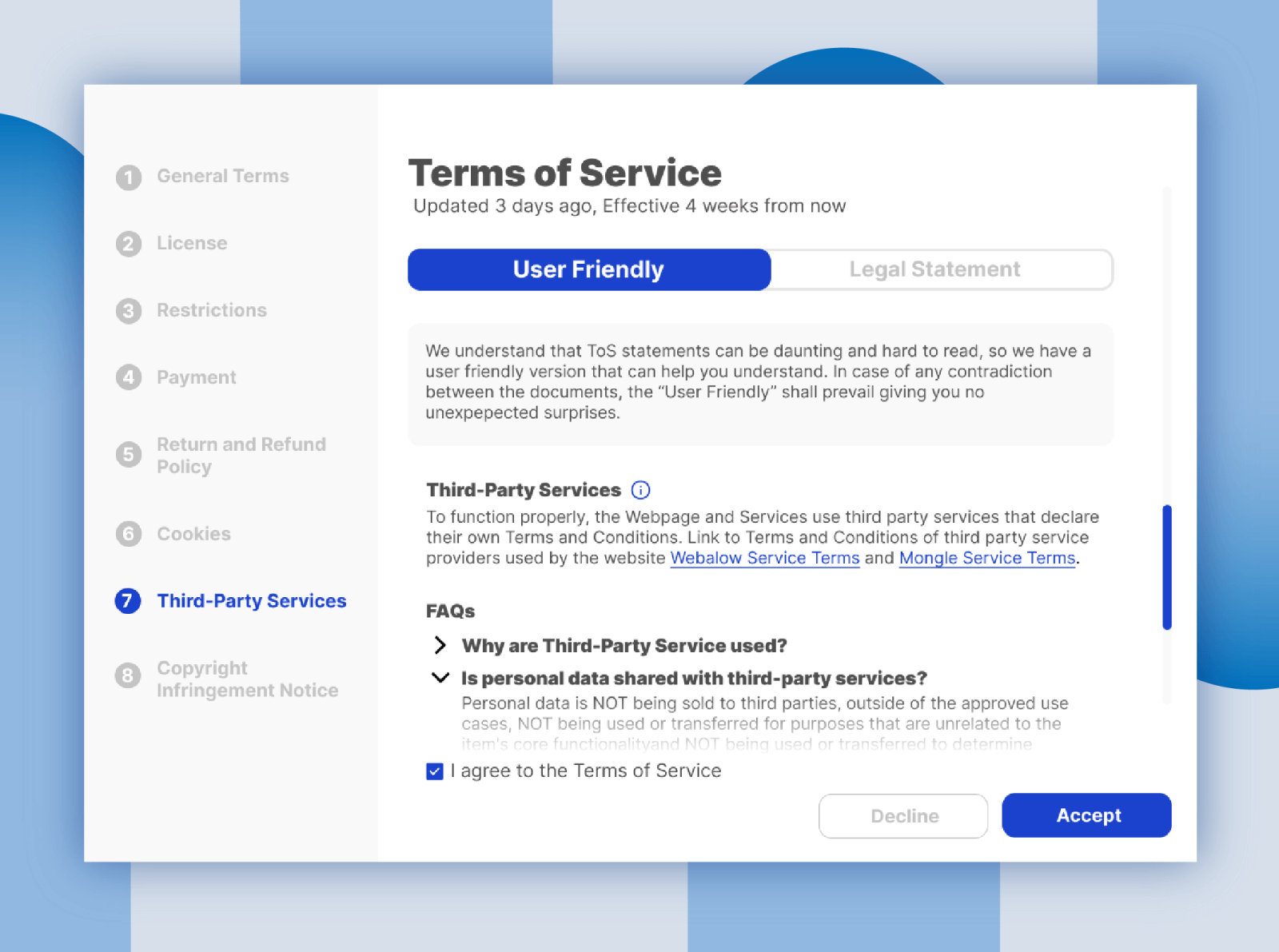
A terms and conditions page is not a legal requirement but saves businesses against financial and reputation losses and proactively informs users about their liabilities. For example, the terms and conditions page on an E-Commerce website clearly states about shipping, return/refund, cancelation, and more. When customers raise a dispute, the page helps keep trouble at bay.
Ensure that no technical jargon is used on the terms and conditions page so that customers can easily understand the policies and agree to use the website while following them.
Key Elements to Include:
- User Responsibilities: Outline what users can and cannot do on your site.
- Intellectual Property: Specify ownership rights for content, images, and other website elements.
- Limitation of Liability: Protect your business by outlining limitations of liability.
- Dispute Resolution: Explain how disputes will be handled, including any relevant jurisdiction or legal guidelines.
Pro Tip: Keep the language clear and straightforward to ensure users understand their rights and responsibilities.
Good to Have Web Pages for Your Website
The must-have pages are the foundational structure of the website, and expanding the website with additional pages makes the website comprehensive. Considering these pages will improve the conversion rate to a great length.
Unfold the reality with a ”Testimonials” page
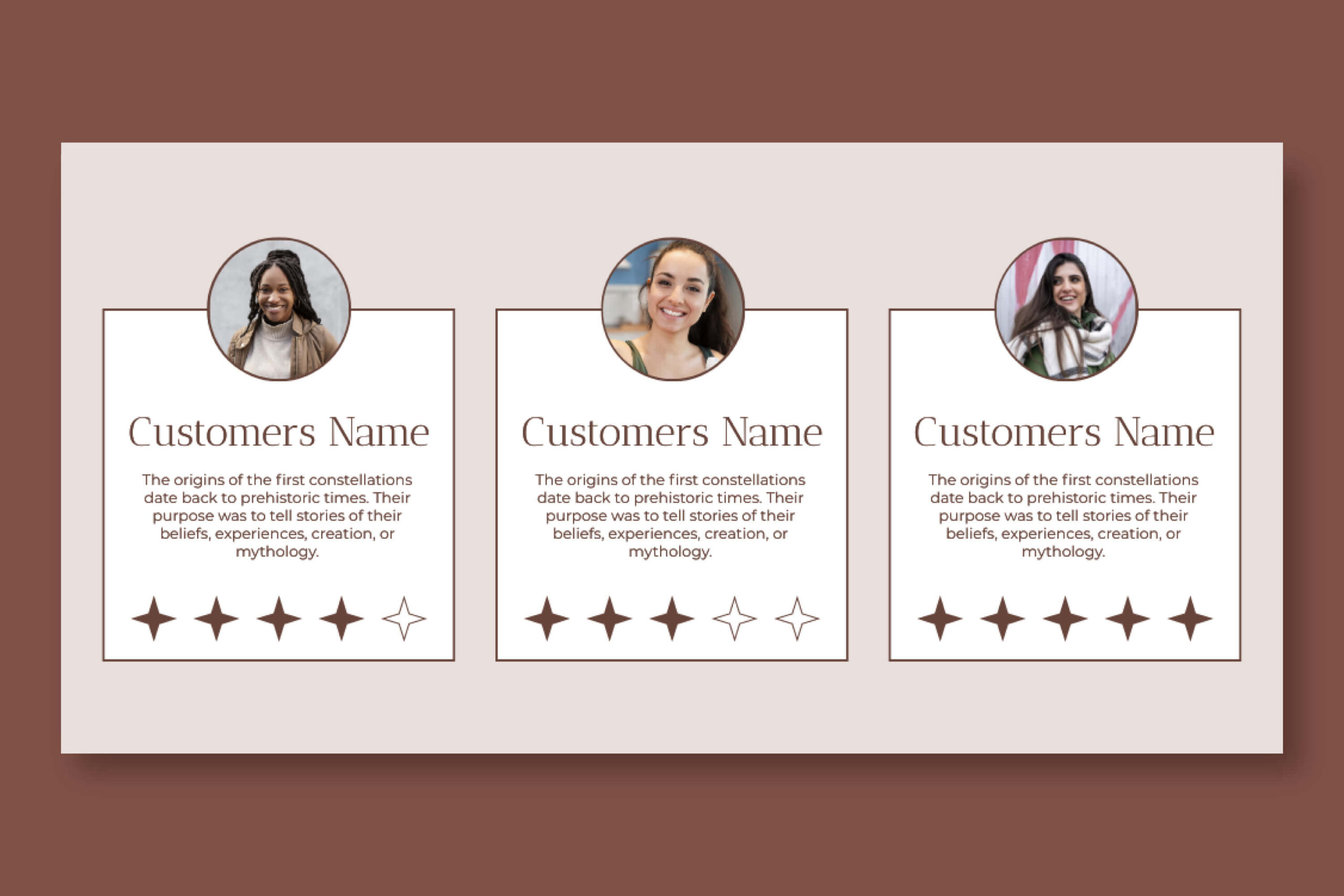
Regardless of how much you boast about products/services in a non-marketing pitch, customers always look for the reviews or testimonials the existing customers have provided. It acts as social proof for the offerings you provide. Creating a testimonial page consolidates all the reviews, ratings, magazine interviews, and even links to the video testimonials, that are easy to access.
Additionally, don’t modify testimonials because modern customers often connect with existing clients to cross-check their authenticity. Post feedback honestly builds customers’ trust in the business.
“FAQ” page to provide answers quickly
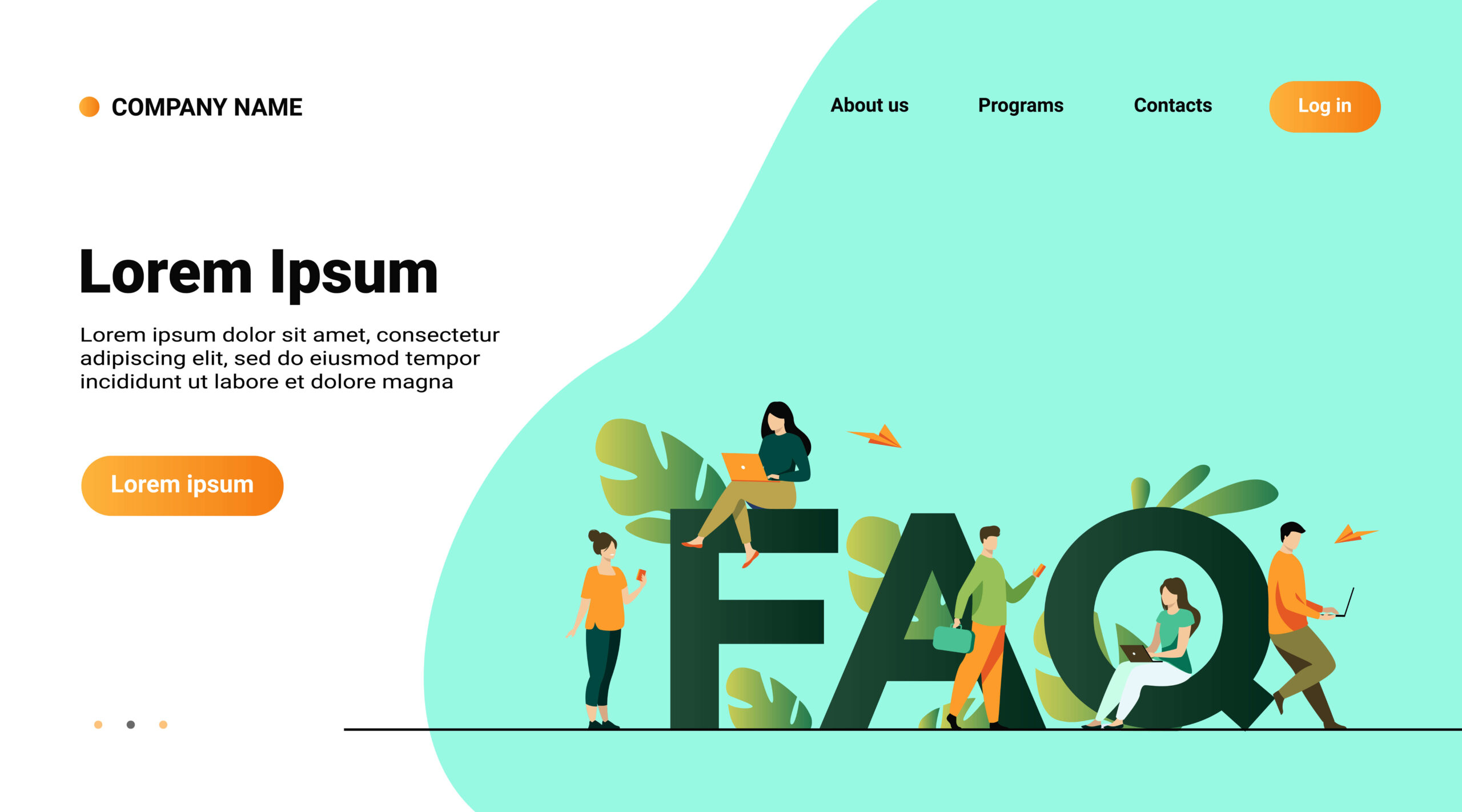
Most often, different customers ask the same questions to the customer support services, which wastes a lot of time. That’s where creating a knowledge base in the form of FAQs (Frequently Asked Questions) allows customers to get answers to the questions before reaching out to the customer support team. FAQs must be segregated based on categories so that customers can quickly find the questions and answers. Ensure the answers must be specific and concise to clear up all doubts that customers have and get convincing answers.
The ”Sitemap” page improves content discoverability
Search engine crawlers look at the sitemap to understand website’s hierarchical structure and easily crawl and index web pages. Also, when businesses add new pages, crawl bots can find them swiftly. Here, adding a sitemap page is a good move that lists all the web pages on the website. If unsure, considering Google documentation will help create the best sitemap that makes the content discovered.
“404” page when a web page is not found
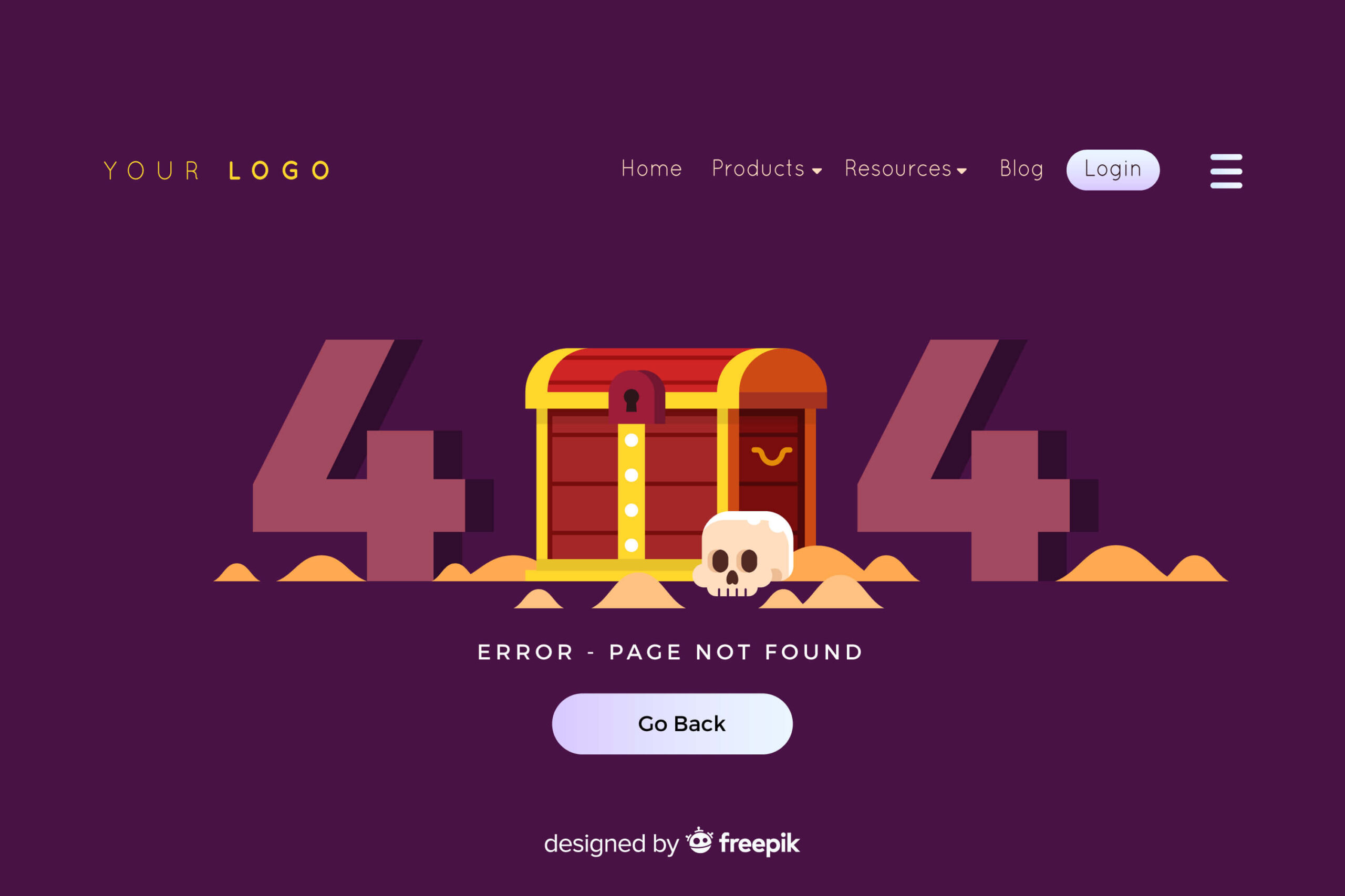
It’s pretty frustrating for website visitors to see if the link they clicked is not working anymore. Most of us have experienced a 404 error age displayed on such pages, which allows users to go back to the homepage. Some businesses are getting creative with 404 pages, using animation or attractive images to engage users and allow them to escape from frustration quickly.
“Return/Refund” page to streamline shopping experiences
Easy returns/refunds are the first thing that people look at before purchasing from the website. You can showcase business legitimacy by building a return/refund page that allows customers to view all the information related to returns/refunds. Ensure the information is detailed and relevant to the customers without overwhelming them. Also, it saves customer support time that would otherwise be spent answering questions related to returns/refunds.
Provide shipping information upfront with ”Shipping” page
Customers have a lot of expectations from order shipping services. Estimated shipping time, shipping options, shipping cost, and shipping locations are common queries before placing an order. The shipping page answers all the questions that customers have about shipping and lets them have significant experience with their product shipment. The information on the shipping page can also be designed in the form of FAQs that help customers to get answers quickly.
Optional Website Pages That You Can Opt to Keep or Skip
Must-have pages are the cake bases, and good-to-have pages are the icing on the cake, but optional pages are the extra cherries, making the cake look so great.
- The search result page displays the web page as users enter their query in the search box.
- The news page allows users to stay current with the latest updates about the business, be it an event, attending a conference, or a new launch.
- Career page facilitates job seekers to directly see open vacancies at the business workspace and apply.
- Partner page displaying the list of experts that help business clients with required consulting services.
- The disclosure page discloses all the terms and conditions for affiliates and advertisers.
Create a Website Structure With All the Required Pages
Modern web design trends craft digital experiences that are immersive and influence website credibility positively. The visually stunning website must have a website structure with essential web pages included. Based on business size and digital needs, the website pages are selected, customized, and designed following a hierarchy. If you are confused about what pages your website should have, web development companies will help you know which pages you should keep based on your website goals.
 Avantika Shergil
| Nov 5, 2024
Avantika Shergil is a technology enthusiast and thought leader with deep expertise in software development and web technologies. With over 8 years of experience analyzing and evaluating cutting-edge digital solutions, Avantika has a knack for demystifying complex tech trends. Her insights into modern programming frameworks, system architecture, and web innovation have empowered businesses to make informed decisions in the ever-evolving tech landscape. Avantika is passionate about bridging the gap between technology and business strategy, helping businesses build customized software and website, and understand about different tools to leverage effectively for their ventures. Explore her work for a unique perspective on the future of digital innovation.
