When you have only 10 minutes to visit the National Gallery in London, what do you do? You quickly ask about Van Gogh paintings, then find the Sunflowers, and then relax. You will have the best experience in such a short time. The mobile app design resembles this visit, where people get a feel of the app design in a few seconds.
The UI paints a picture of UX because people don’t have time to waste on poor UI. They are looking for sunflowers in your app design. If the mobile app images take too long to load, the layout is unattractive, the design elements are not properly organized, and the design appears cluttered, then users take no time in abandoning the app.
Let’s dip your toes in the water to know what statistics are saying:
- 75% of people give time to read the content that’s beautifully designed when they have 15 minutes to navigate the app.
- 90% of people stop using the app if images take too long to load.
- 74% of the visitors return to the app if it delivers a good user experience.
The UI and UX statistics showcase that it’s essential to master the art of app design, or else you lose the game. Before digging deeper to know- how to engineer an exceptional design for your mobile app, let’s understand its core concept in a nutshell.
Table of Contents
- What is mobile app design?
- What do you mean by good UI/UX design?
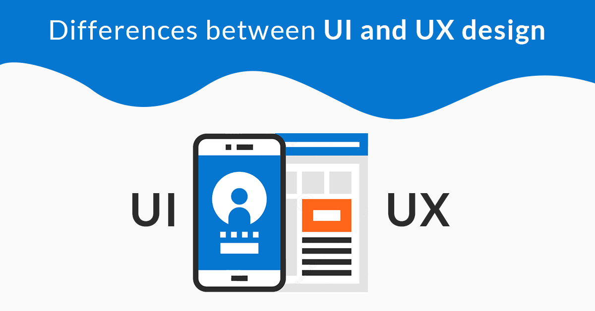
- Which are the differences between UI and UX design?
- What market has to say about mobile app design?
- What are the recent trends in app UI design?
- How brilliant UI/UX design for mobile apps can help your business grow and prosper?
- How to design an effective app for your business growth and success
- What to keep in mind to bring more rewards with UI and UX designing?
- Top mobile app design slip-ups that you should avoid
- Ready for exceptional UI/UX design?
- How to choose a mobile app design partner?
- Looking for a mobile app design team?
What is mobile app design?
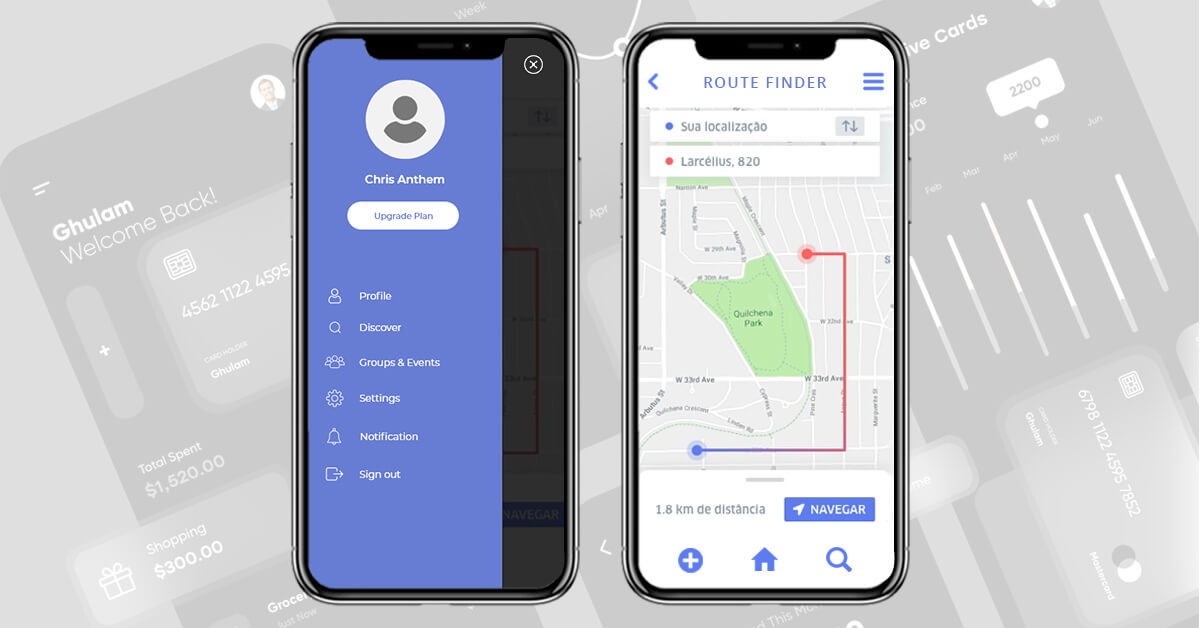
The mobile app design is a front-end of the mobile application that users can view and enable them to navigate through the app. The visual interface is not only a combination of colors, fonts, animation, buttons, and other design elements. Instead, it’s beyond the rich visuals. The team of UI UX mobile app designers and developers conduct market research, create a prototype, conduct user interviews, and perform rigorous testing to craft the app’s UI that ensures seamless UX rendering.
Let’s understand the differences between the two.
UI designing
UI design involves selecting the visual presentation, including color scheme, icons, typography, and spacing, to create an attractive and appealing layout. The design of the app’s UI showcases the brand’s identity, helping to attract more customers.
UX designing
UX design involves creating a seamless user experience by understanding the emotions, perceptions, and satisfaction of the customer. The simpler and easier the app is to interact with, the more effective the UX design is considered.
What do you mean by good UI/UX design?
UX design is about how intuitive, inviting, and easy to use the app is, which makes users experience something unique. The feeling that users carry in their minds after using the app is the experience that they have. UX design ensures that users get the best experience after using the application.
Which are the differences between UI and UX design?
Often, UI and UX design are not understood fairly. Commonly, if the UI design makes the users experience the product/service, then you are a UX designer. It’s the biggest myth. It’s like- if you can fix the problem in the pipeline, you are a plumber.
“UI is focused on the product, a series of snapshots in time that is specific to visual style, structure, labels, and more. UX focuses on the user and their journey through the product.” – Scott Jenson, former product strategist at Google.
What market has to say about mobile app design?
Amidst fierce competition, it’s onerous for businesses to get a space in the users’ minds despite getting a mobile app or web app developed. Businesses are focusing on building user-centered applications that engage and convert them.
UI/UX design is a powerful weapon that can help businesses not only change the game but get ahead of the game. Unarguably, the UI/UX design is key to an app’s success. Bank of America is a real-life example of a UI/UX design use case. The bank when redesigned the 5-step online banking enrollment process, and the improved UI/UX design brought a 45% increase in conversion rate.
A few more stats demonstrate the contribution of UI/UX design to businesses.
- Users decide to continue using the app or abandon it within three seconds when using it for the first time.
- 70% of small projects fail due to poor UX design.
- Good UI/UX design reduces customer support costs by 90% and uplifts performance by 53%.
- Poor UX design makes the users switch to the competition.
What are the recent trends in app UI design?
With technological changes and user preferences evolving, app design trends are also changing to keep up with the market and users. Here are a couple of mobile app design trends that make your app take the driver’s seat.
- Augmented reality and virtual reality add new effects.
- Artificial intelligence taking user interactions to a new level.
- Facial recognition technology enables login without a password.
- Multi-directional navigation transforming user journey.
- Voice interface delivering a personalized experience.
- Liquid swipe enables the buttonless design that users like the most.
How brilliant UI/UX design for mobile apps can help your business grow and prosper?
Small businesses have gone online in the thrust of users at looking their offerings digitally. They need to deliver the same services and experience to the users that they are receiving online. The cross-channel experience with UI/UX design optimization breaks down the barriers when services are offered through physical and digital stores.
For instance, as the customers step inside the store, they are warmly welcomed by the reps and then guided to the best shopping experience. When the customers get similar help as they start browsing the digital store, they will be more convinced. The UI/UX design help in easily navigating the store and effortlessly getting to the things they want.
Improve user acquisition
In the crowded world, you just name it and have hundreds of options for everything. The UI/UX design is a magic wand that can make your app stand out in the crowd. A better mobile app UI design can impress users at first sight and turns them into potential customers forever. Craft an aesthetically-pleasing application with all the design elements well-placed, in-line with color palates, and drive maximum interactions.
Increase user retention
The first impression created by the mobile app, at first sight, creates an indelible impression on the users’ minds that lasts till the brand exists. In the same vein, the personalized journey with every suggestion or recommendation tailored to the users’ browsing pattern, purchase history, or other preferences makes them purchase repetitively. The user retention rate is healthy for financial gains for mobile applications.
Enhance brand awareness
The online presence with fair UI/UX design enables the brand to get recognized in the market at scale. The brand logo, color, and other design elements become the hallmark of the business that makes users recognize the brand easily. The improved familiarity and credibility create the grounds for user engagement and increased loyalty.
Optimize productivity
The well-researched and well-crafted app’s UI allows users to easily search for what they are looking for and navigate through the app smoothly. It satisfies the users and improves the chances of buying on impulse, which, in return, improves efficiency and productivity.
Improve conversion rate
Conducting user research and usability testing can provide insight into the navigation structure, layout, minimal design, and content that users prefer to see in an app, capturing their interest. By incorporating app design tips that prioritize a user-focused approach, you can increase conversion rates and retain customers more effectively.
Modern customers are ready to pay more for an exceptional experience. When the business gets to build an application with aptly designed UI/UX, the users will visit the store and prefer to buy repetitively. It justifies that app design improves the conversion rate which makes the business profitable.
Get a competitive advantage
A good UI/UX design differentiates the business from the competition. Various free tools are available to get the app designed at no cost, but businesses approach development companies to get the app well-designed. The well-designed product is well-received by the users. For instance, Facebook gets an upper hand over My Space only because of the UI/UX design. Apple is also a great example of design thinking that makes people pay more for Apple product purchases.
Enhance consistency
Mobile app design is not only about adding visual components consistently. Instead, it’s about using the right mix of UI and UX components that provide a unique look and feel to the mobile application. The tailored design has all the visual elements arranged in sync and consistently, they deliver the best user experience.
Reduced designing costs
The well-planned design engineering reduces the time, resources, and effort investment that otherwise go in vain in crafting irrelevant or unnecessary design elements. Also, it eliminates the chances of changing or upgrading the design frequently which saves a huge amount of money and time.
Top mobile app developers always conduct user research to design the app, minimizing wasted effort and reducing the cost of app development. This research results in a design plan that meets the needs of target users, leading to quicker approval with minimal changes.
How to design an effective app for your business growth and success
Creating unparalleled UI/UX design is an art of science that includes five basic components that the top UI/UX designers always consider.
- Product hypothesis
- Information Architecture
- Discovery workshop
- Interaction design
- Usability
- UX wireframe creation
- Prototype building
- UI designing
- App design testing
What to keep in mind to bring more rewards with UI and UX designing?
Here are some essential tips to keep in mind when it comes to designing a mobile app.
Keep it customer-oriented
Keep in mind, it’s a mobile app. The screen sizes vary largely, so the designs must be crafted in a way that they appear impeccably on every screen without cutting corners or with the image resolution problem. Second, the navigational buttons’ position and size must be kept optimal catering to wide audience needs.
Make it easy to navigate
When designing apps, ensure that the navigation drawer of the app is visible to the user. Keep things simple and visible for the user so that they don’t experience cognitive load trying to find out where to go.
Also, make the app finger-friendly, meaning that the buttons should not be too small for people to click using their fingers.
Make it interactive
Not breaking convention is okay, but make mobile app browsing fun. Wrap the app with cool buttons, new fonts, 3D effects, beautiful colors, moving elements, texture, and more that users love. There are numerous options that you can try but don’t overdo keeping simplicity in mind. It smoothens the user’s journey.
Cater app performance needs
The users are great skimmers when the functionality or image takes time to load. After five seconds of waiting, the users start thinking to shift the app as an alternative, which means you are losing valuable users. Optimize the app UI-UX to encourage conversion and retention rates.
Pick colors and fonts mindfully
Life would be so dull without colors, wouldn’t it? UI/UX designers are no less than artists, and they sometimes get carried away in terms of using color. The choice of fonts and colors will have a massive impact on the design of the app. Always try to match the color and font of the brand into the app. This will make the app a seamless extension of the client’s brand.
Design for simplicity
The concept of minimalism is the latest user-appreciated factor for designs. Make the app look modern, use whitespace liberally, and use familiar symbols and phrases to make the app simple to use.
Do not overwhelm app users with too much information on the screen; instead, keep the User Experience (UX) easy and enjoyable.
Collect feedback on your design
Before you go ahead and launch the app into the market, taking feedback is essential. Constructive feedback can prove to be a pretty powerful tool for practical design. By receiving quality insights from like-minded professionals and clients, you will be able to see things from a different perspective.
You can take feedback in the following manner.
- Send out short surveys to your clients for feedback.
- Use tools that are designed explicitly for feedback
- See in-person how potential users find your app design and its usability.
By having a great feedback loop, you will be able to consistently improve your product and understand what is working and what is not. Once you identify these things, you will be able to go back to your designers and make the necessary improvements.
Think about visual hierarchy and weight
Visual weight is defined as the impact of different on-screen elements as compared to other factors. By using visual weight, you will ensure that your design’s most critical aspects always stand out.
Make sure that the hierarchy that you build is always consistent. This is important because it will help app users get an idea about the orientation of the app.
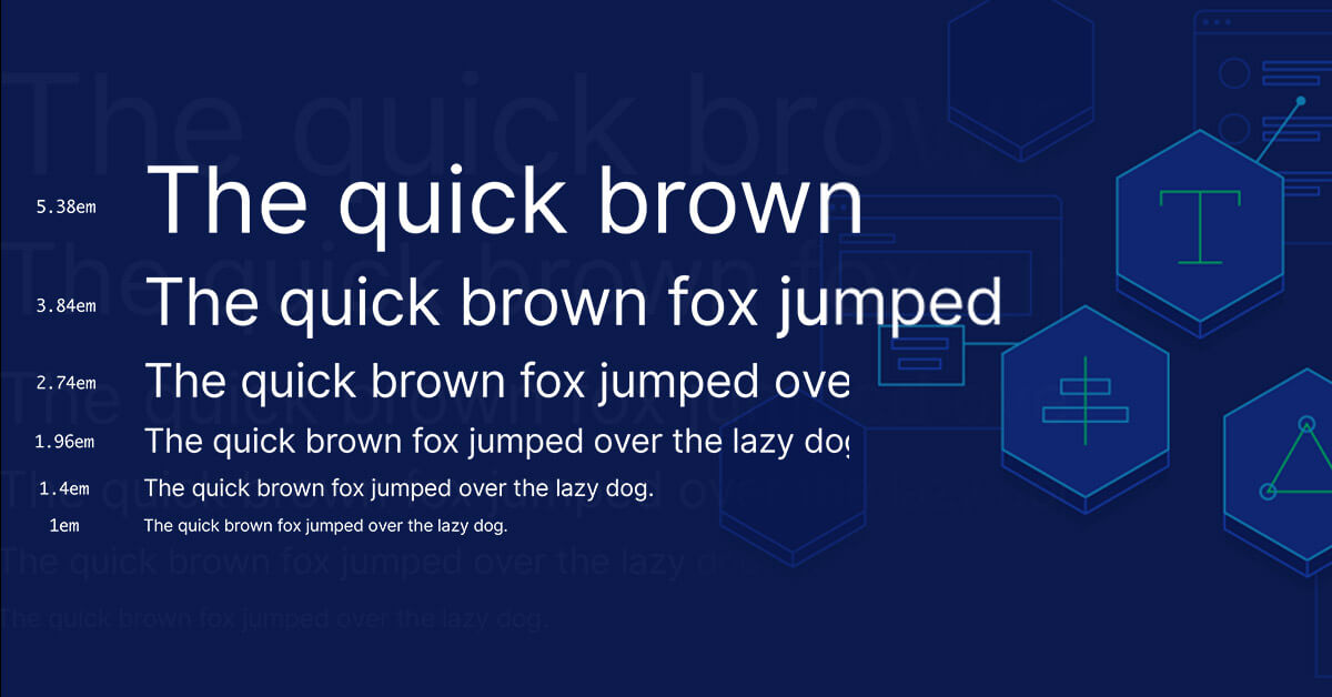
Keep a sizable difference between fonts so that the users know what is essential.
Top mobile app design slip-ups that you should avoid
Catching the eye of the App Store, even for the apps built with the right mix of must-haves, nice-to-haves, research, the latest app development trends, and experimentation has become a daunting task. It’s because the mobile app market has reached a saturation point where the trends are changing one day after another. The apps downloaded won’t find more than 20% of the users returning to the app after its first use and after a month, a trivial number of users keep using the app.
It’s displeasing, but the harsh reality of the app market. It takes just a few seconds for the users to shun the app if they found it imperfect, or not in line with their expectations in anyways. In such scenarios, neither compromising on the app’s quality an option for the business nor the app’s success rate is acceptable.
It emerges a series of questions like- Why the app loses its sight after a short tenure? Why the simplicity appears monotonous and graphic-rich design complex to the users? Why do the apps fail to maintain consistency in the long term? How can the app pack with several features offer a pleasing experience?
The answer is clear. The apps which don’t mess up with the UI design stay appealing, alluring, and amazing to the user base. However, during the app development and designing, there is a ton that goes wrong. Avoiding design engineering mistakes across the board is important to make the app top the charts.
To let your app live forever, the proficient team of designers has rounded up the top 7 mobile app UI design mistakes, which should be kept at arm’s length to enhance the user experience and maximize the business outcomes.
They are:
Engineering design without any purpose
The features, navigation structure, user interface, and graphic elements must be incorporated into the app with a user-first approach and solve the user’s problem, instead of maintaining pace with the trends.
The functions developed and designed must serve the purpose and delight the users as a coherent whole. Conveying the business vision quickly brings value to the app and communicates the best impression to the users. Joining the rat race doesn’t make any sense, in place, attempt to design an app idea that fills a niche or offers a distinctive service with a user-centered design approach.
UI design is not mapped with UX
Very often, it’s deeply ingrained in the immature designers’ culture to create aesthetic designs and add details to the app with the ‘designing for the designer’ mindset. The imperfect details, poor navigation structure, and buggy logic make the user feel as if they are alien to the app.
Excellent UX must be ensured while wireframe sketching that the flow, design elements, and navigation structure would be liked by the users in the final launch or not. In the excitement of app designing, designers should stay careful to not skip the planning for the app’s UX.
Crowding the app with a plethora of features
The app’s utility won’t depend on how many functionalities the app provides under the hood. Stuffing the app with a horde of features confuses and disorients the users just like the overdose of the medicine has its side effects.
Unnecessary addition of features simply ruins the app’s impression and interferes with the user experience because the users expect to get more in less. At first, gain the user’s trust with concise features, and then in the future updates, add up new features, which also help in meeting the app development timeline.
Disregarding the user context
The app is always best-in-class from the designer’s point of view, but, the same is not necessary from the user’s perspective. Although the full-fledged solution is working well, this cannot be the event for all types of users from different geographic locations, or demographics. The app’s interface must be designed in the user context so that all the users find it simple to use, understand and navigate.
Get going to know who your audience is- tech savvy, non-tech, new users, repetitive users, or Millennials, then start designing the app as the app design heavily relies on the user context.
Design inconsistencies across different platforms
Mobile app development doesn’t mean translating web experiences onto mobile screens. It’s not about scaling down everything, it’s designing the app function, content, and navigation with a minimal strategy.
The designers don’t have to change the mobile design for various platforms, but paying attention to the interface guidelines removes the design irregularity issues, which hurts the UX.
Making the designs overcomplex
Playing with the design elements is good, but the experimentation with standard icons or symbols muddies the water as these visual cues become difficult to understand and the needless efforts clutter the screen and create distractions which in due course, lead to design complexity. The designers should not try to put as many elements as they can on the screen, the reason being their artistic flavor doesn’t make the composition exciting. Design the app reductively and give the elements on the screen room to breathe to keep the UI simple and intuitive.
Paying less heed to the app beta testing
Appointing the in-house team for testing what’s missing or what’s wrong with your app is a good practice. But, these beta testers cannot be as efficient as the future app users to dig into the drafts. At first, by ignoring the beta testing, you are risking launching an app that may flop. Secondly, not utilizing testing methodologies efficiently to its full flow as the targeted audience would, again risk app failure. This is so until the app won’t win the battleground in the trial process, how can you rest assured that the app will deliver what’s expected out of it?
Mobile app design is an important factor that could make it to the win or a loose condition. The reason is that it directly deals with the users of the app. The design should be such that it should have the targeted user’s persona and avoid some of the most common mistakes of designing will go a long way to ensure that the app you developed connects with the users and also scores brownie points.
Ready for exceptional UI/UX design?
Saying UI/UX design is the lifeblood of the application/website that businesses getting developed are not hyperbole. When UI/UX design is crafted with all the secret ingredients added in the right proportion, iconic success will be the result.
The user-centered design has the power to appeal to the users, convince them for shopping, and engage with the business repetitively based on the positive experience they received and will have a positive attitude towards the business. After knowing UI/UX design benefits, it makes perfect sense to design the UI wearing a UX lens to deliver the offerings digitally in a way that users want.
How to choose a mobile app design partner?
You know the mobile app design process and the best practices to follow for elegant designing, but without the help of proficient UI/UX designers, realizing success is impossible. It requires choosing the top UI/UX designers for a mobile app design project. Understanding the need of businesses, here are the tips to hire the right team for mobile app designing.
Ask for portfolio
Before selecting the app design service provider, you should ask for a portfolio. While looking at the portfolio, pay heed to designs that draw maximum users’ attention; view the businesses with which they have worked; figure out the design process, best practices, and strategy followed.
Check testimonials
Verify the reviews and testimonials from previous clients that helps in knowing the quality of services offered. Clutch, TopDevelopers.co, and other online directories are the best places to identify what clients speak about their experience with company services. The comparison of clients’ expectations and services received gives you rich insights into the quality of services offered by the company.
Screen the candidates
After you have narrowed down the choice of hiring a mobile app design company to a few, it’s time to choose the best one by interviewing the designers. The interview process helps in finding out communication skills, technical knowledge, experience, and a lot more.
Looking for a mobile app design team?
The app design requires professionalism, creative twist, and aesthetic design engineering. Such meticulous app design enables the business to achieve goals. Nailing the art of the best mobile app designing require going through all the app design trends, process, and best practices, and partnering with the right app design company. It helps in mapping UI/UX carefully from User research to design delivery, but that’s a real challenge.
For building a design that goes beyond UI designing and delivering unparalleled UX, you need to partner with the top mobile app designers with experience that adds value to your business app.
 Avantika Shergil
| Feb 22, 2023
Avantika Shergil is a technology enthusiast and thought leader with deep expertise in software development and web technologies. With over 8 years of experience analyzing and evaluating cutting-edge digital solutions, Avantika has a knack for demystifying complex tech trends. Her insights into modern programming frameworks, system architecture, and web innovation have empowered businesses to make informed decisions in the ever-evolving tech landscape. Avantika is passionate about bridging the gap between technology and business strategy, helping businesses build customized software and website, and understand about different tools to leverage effectively for their ventures. Explore her work for a unique perspective on the future of digital innovation.
